The article examines in detail the use of open data and geospatial analysis to track events in the conflict between Russia and Ukraine. This comprehensive study shows how modern technologies and data collection methods can be used to document and analyze conflict zones, providing an important contribution to the understanding of international crises. The article is important for geopolitical experts, journalists, researchers, and anyone interested in using open sources to monitor global events. This article also emphasizes the importance of open sources of information in today’s world of investigative journalism. It demonstrates how data collection and analysis can promote transparency and accountability in international conflicts, and highlights the role of digital technologies in today’s investigative process.
In this article, you will find a detailed analysis and overview of the Russia-Ukraine monitoring map, which shows the events of the conflict for more than 500 days. We consider data collection methods, their analysis, and the impact of these information resources on understanding global events. The article provides insights into the use of open sources in journalism and research, as well as the importance of digital technologies in today’s conflicts.
A detailed review of the Russian-Ukrainian conflict
In January 2022, the Center for Information Resilience (CIR) launched the Eyes on Russia project to collect, verify, and map video, photographs, satellite images, or other open source media related to Russia’s invasion of Ukraine. It was hoped that everyone would have access to reliable and accurate information about Europe’s biggest conflict since World War II.
The Eyes on Russia project coordinates the efforts of a wide open source community (OSI), including organizations such as Bellingcat, GeoConfirmed and many others, as well as independent volunteers. Each participant contributes their own conflict data collected from open sources, including records from the Bellingcat Civilian Damage Map.
Each organization makes a unique contribution to this collaboration. The Incident Investigation Center (CIR) is responsible for managing, sorting and cleaning the data that enters the main database. The CIR also reviews all records, collects, analyzes and verifies information, focusing on damage or loss to civilians, medical facilities, educational institutions, communication and energy infrastructure.
GeoConfirmed collects data from the open source community on Twitter (X) via the @geonconfirmed Twitter tag.
The “Geomouse” volunteer group, formed on the Bellingcat Discord channel, specializes in collecting videos and images of civil infrastructure damage posted on Telegram. The Incident Investigation Center (CIR) also receives data from numerous independent volunteers. Map created and updated by C4ADS.
This map is available for viewing on both computers and mobile devices. As of July 24, 2023, it has already been viewed by more than 3.5 million people. The map features more than 11,600 verified videos and images that provide an accurate, up-to-date and detailed view of events in Ukraine. So far, GeoConfirmed has added 5455 entries to the map, CIR 4211, Bellingcat 783. Independent volunteers have contributed 725 entries and Geomouse 458.
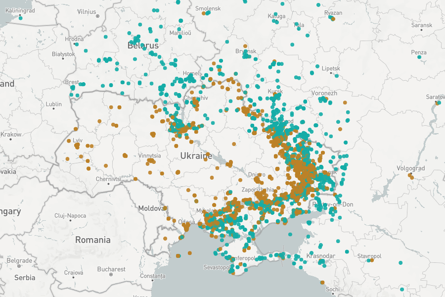
Overview of Ukraine on the Eyes on Russia map at the time of publication
Open source researchers and the wider community are working to verify information using geolocation and chronology. After collecting content from social networks, all information is registered in a central database and archived for further use by researchers, journalists and law enforcement agencies.
Before the information reaches the map, it is further checked by highly qualified CIR researchers to ensure the accuracy and security of the data.
We also care about mental health and graphic sharing. Our research teams evaluate the content on the map to determine the level of graphics. Highly graphic content is not previewed to alert future researchers and the general public to the nature of such content.
Each piece of information on the map is validated and given a short description and category (or categories) to make it easier to find specific trends, patterns, or details in the data. The map features many colored pins that represent different categories of open source videos and images, and the key to them can be found in the right column of the map. It is important to note that the categories may change due to events such as the Russian invasion of Ukraine.
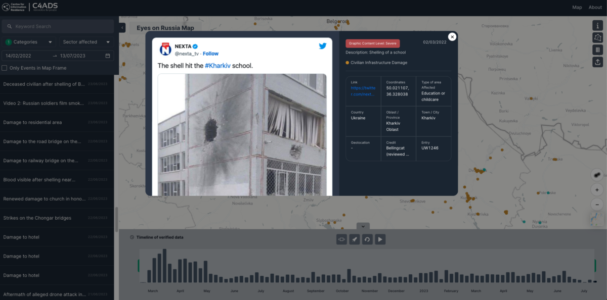
For example, in the image below, an entry in the category “Damage to civil infrastructure” can be seen verified and geolocated showing damage to a school building in Kharkiv on March 2, 2022. It can also be found on the Bellingcat map of civilian damage in Ukraine under code CIV0159.
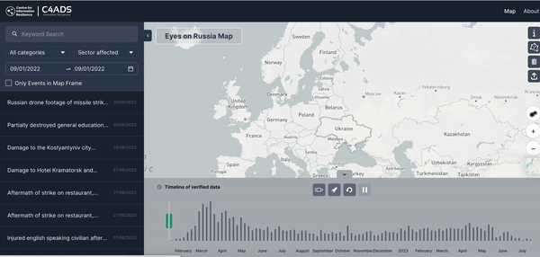
The initial map we published during the full scale invasion was created using MapHub. However, since that time we have made significant changes to the map in collaboration with C4ADS to improve the ability of users to interact with the data. Users can now filter and search for information points using our new custom-made map.
For example, previously our map could only be sorted by date. But after the update, users can now view the data in the left panel by different parameters such as time, category, subcategory, time frame, location or keywords.
Left: Full drop-down menu of new metrics for sorting map data. Right: Date selection for sorting map data.
The new and most frequently used map feature is located at the bottom of the screen. This is a timeline of verified data on the map, from the first to the last entry. As you can see below, this timeline is also playable, allowing you to watch the data unfold on a map over days, weeks, and months.
Additionally, you can also use this timeline feature along with the newly available categories and subcategories. This allows users to track clear trends over time, such as the targeting of education, healthcare or industrial infrastructure, or to visualize the spread of Russian military casualties over time.
The Eyes on Russia map continues to expand thanks to contributions from all its partners and will hopefully continue to be a useful resource for those following this invasion from afar or up close. More information on methodology and data sources can be found on our information page.
The information is taken from Bellingcat’s open sources
While searching for images near Pavlivka, the site of artillery attacks from Russia on Ukraine, we find a series of images of a soldier named Stanislav Tarasov. In this article, we look at the key aspects of geolocation, using photos as the main tool.
To provide the best experiences, we use technologies like cookies to store and/or access device information. Consenting to these technologies will allow us to process data such as browsing behavior or unique IDs on this site. Not consenting or withdrawing consent, may adversely affect certain features and functions.
Functional
Always active
The technical storage or access is strictly necessary for the legitimate purpose of enabling the use of a specific service explicitly requested by the subscriber or user, or for the sole purpose of carrying out the transmission of a communication over an electronic communications network.
Preferences
The technical storage or access is necessary for the legitimate purpose of storing preferences that are not requested by the subscriber or user.
Statistics
The technical storage or access that is used exclusively for statistical purposes.The technical storage or access that is used exclusively for anonymous statistical purposes. Without a subpoena, voluntary compliance on the part of your Internet Service Provider, or additional records from a third party, information stored or retrieved for this purpose alone cannot usually be used to identify you.
Marketing
The technical storage or access is required to create user profiles to send advertising, or to track the user on a website or across several websites for similar marketing purposes.