
18.07.2025
14 min
651

How to visualize climate disasters in conflict zones? This article shows how to use NASA Giovanni to build maps, animations, and timelines to analyze Storm Kenneth, which hit Mozambique. Step-by-step instructions, tools for journalists and researchers, and the ability to export to Google Earth Pro. Learn how to combine weather data with maps of population movements and humanitarian impacts.
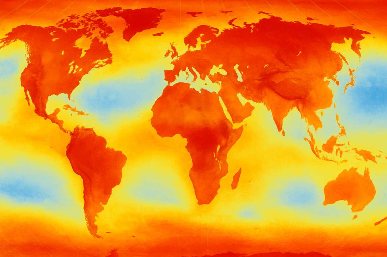
Climate change, conflict and displacement are increasingly intertwined. As extreme weather events increase, resources become scarce, exacerbating social and political tensions and often forcing communities to flee their homes.
In Ukraine, for example, the harsh winter months are compounding the challenges faced by communities already affected by war. This is particularly evident in so-called “cold zones,” where extreme temperatures combined with damaged infrastructure make conditions worse for vulnerable populations such as the elderly and those displaced by violence.
In Sudan, last year’s heavy rains caused the collapse of the Arbaat Dam, causing devastating floods in communities already out of control by conflict. For families fleeing violence, the floods have turned displacement into a catastrophe, exacerbating health risks and food insecurity.
As researchers and investigators, how can we best visualize these dynamics to understand their impact on populations and effectively communicate their relevance to global audiences?
Data visualization is key. It goes beyond simply mapping weather patterns; it tells stories about cascading risks, conflict hotspots, displaced populations, and the spatiotemporal consequences of disasters.
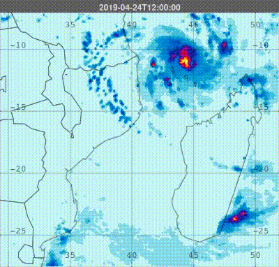
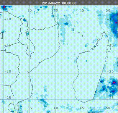
Take Cyclone Kenneth, for example. In April 2019, making landfall as a Category 4 cyclone, Kenneth brought torrential rains that led to catastrophic flooding and landslides that displaced thousands of people. Compounding the devastation, Cabo Delgado was already facing a humanitarian crisis due to ongoing armed conflict.
The GIF below visualizes the rainfall pattern during Cyclone Kenneth, highlighting its path and effects.
Let’s take a step-by-step look at the example of Cyclone Kenneth to demonstrate how tools like NASA’s Giovanni can capture the unseen forces driving these disasters, clearly highlighting the climate component of your analysis.
Before diving into data mining tools, take a moment to shape your approach. Every effective investigation starts with the right questions:
What was the event? (Context and background – was it a cyclone, drought, heatwave or other hazard? Who was affected?)
Where did it happen? (Identify spatial boundaries – city, region or specific community?)
When did it happen? (Identify temporal boundaries – single day, season or long-term trend?)
What climate indicators tell the story? (Choose key indicators – precipitation, temperature anomalies, wind speed, etc.)
With these answers in mind, you’re ready to dive into the data.
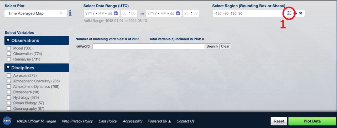
NASA’s Giovanni (GeoSpatial Data Interactive Online Visualization and Analysis Infrastructure) is a free web-based tool that makes it easy to access, visualize, and analyze Earth data without specialized software or coding.
Based on NASA’s GES DISC, it offers a wide range of satellite-derived data, including precipitation, temperature, aerosols, soil moisture, and vegetation indices. Users can create maps, time series plots, and anomaly analyses, adjusting spatial and temporal parameters to explore patterns and impacts of climate events. Whether tracking storms or mapping droughts, Giovanni transforms complex data into clear, actionable insights.
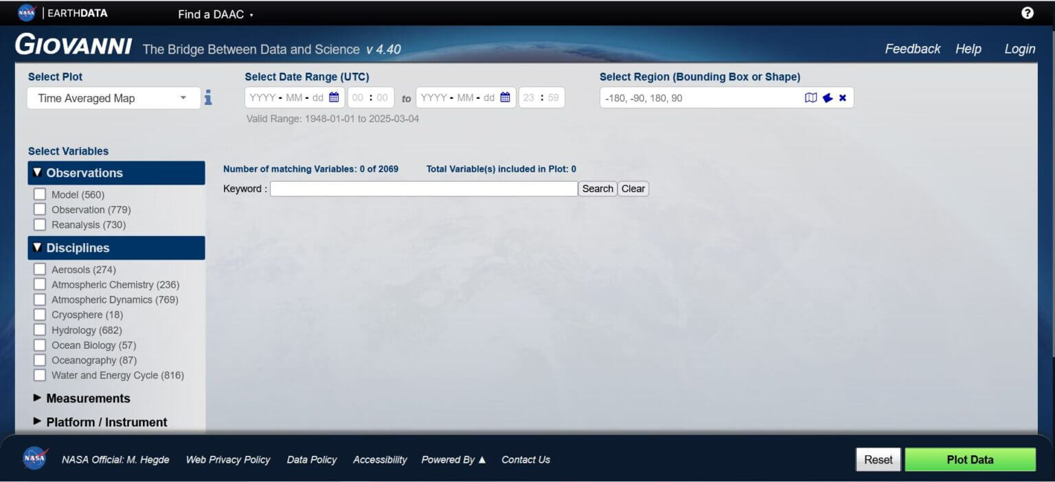
To get started with the tool, go to the top right corner, click “Login,” and sign up to create a free user account that will give you access to all of the tool’s features. Available datasets, covering a wide range of variables, can be browsed and filtered using the “Select Variables” panel on the left side of the main page.
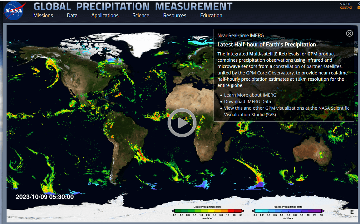
In this tutorial, we will use NASA’s Global Precipitation Measurement (GPM) dataset to visualize precipitation patterns. This dataset provides high-resolution precipitation estimates in near real-time using satellite observations. Providing global coverage and increased accuracy over land and ocean, it is ideal for mapping the intensity and distribution of precipitation during cyclones.
Visualization I: How does this climate-related event compare to previous years?
By visualizing trends over time, we can identify anomalies. Creating a periodic time series graph allows us to compare any precipitation to past patterns. These climate-related extremes are unusual, meaning that the affected areas and communities often have little or no prior experience dealing with them.
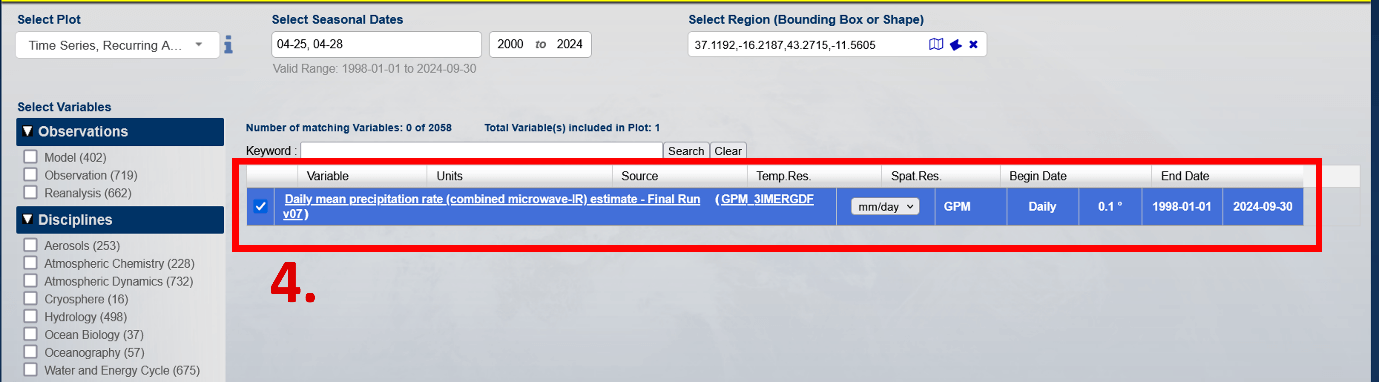
Identify the specifics of the data (see red boxes below):
1. Select the graph: Time Series, Periodic Averages.
2. Select seasonal dates: 04/25, 04/28, 2000 – 2024.
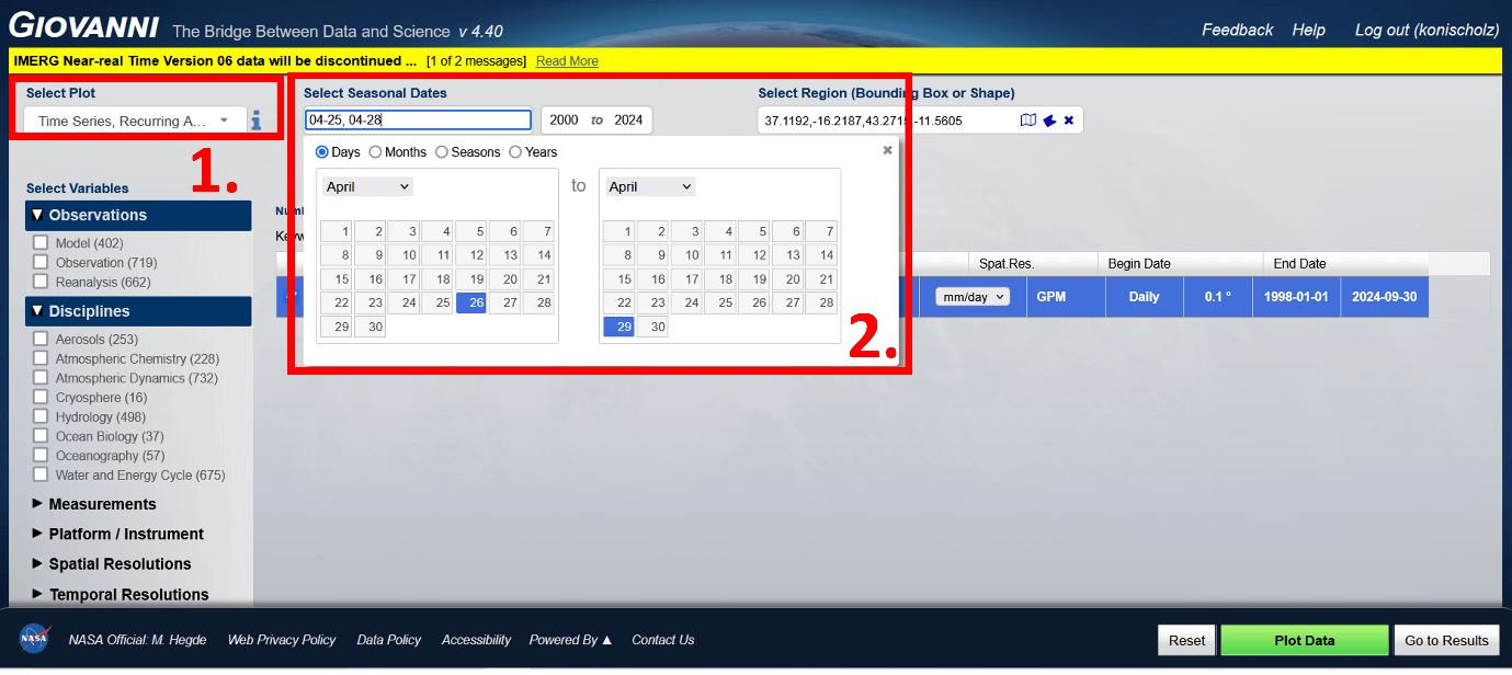
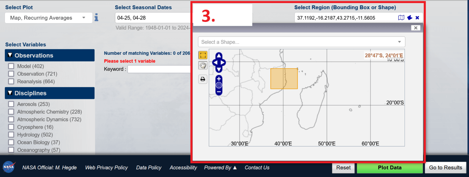
3. Select a region: Focus on the coastal area of Cabo Delgado (e.g. boundary points: 37.1192,-16.2187,43.2715,-11.5605).
4. Select a dataset: Search for the keyword “IMERG Daily” and select “Estimated Mean Daily Precipitation Rate (Combined Microwave-IR) – Final Run” ( GPM_3IMERGDF v07 ).
Exporting a graphic
1. Select export options
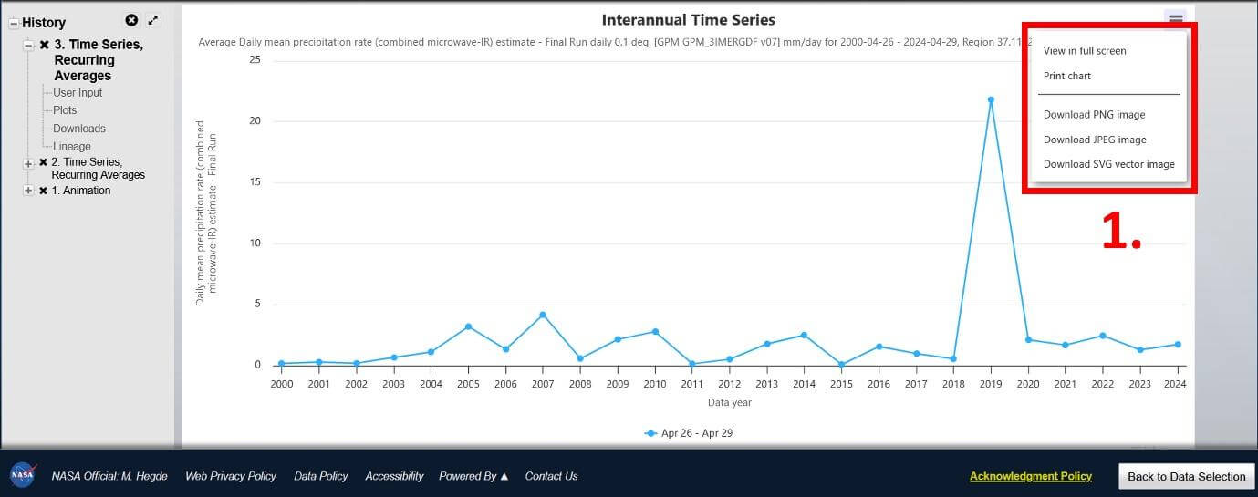
Final export
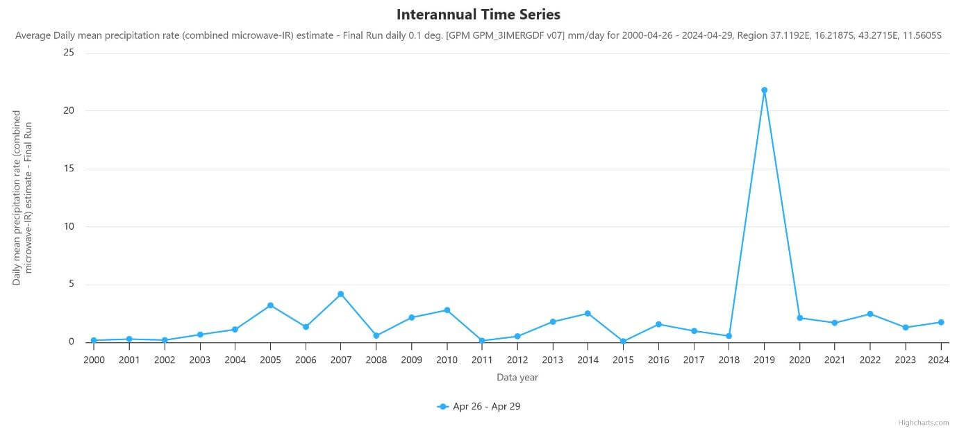
The exported chart shown above illustrates the average daily rainfall in the coastal areas of Cabo Delgado from 26 to 29 April 2000 to 2024. The sharp peak in 2019 marks the impact of Cyclone Kenneth, demonstrating an extraordinary departure from historical rainfall levels for this time of year. The average daily rainfall reached 21.8 mm/day on these dates in 2019, while the maximum recorded in any other year from 2000 to 2024 was 4.2 mm/day in 2007.
While communities are generally well adapted to regular seasonal weather variations, events of this magnitude fall far outside the expected range, making preparedness and response significantly more challenging.
Visualization II: How did the storm unfold over time?
Creating an animated visualization of a storm’s progress helps you track its movement, intensity, and areas of impact over time. Using rainfall amounts rather than wind speeds emphasizes the impact of the rain, making it easier to see where the rainfall has increased and the regions that have experienced the heaviest rainfall.
While the previous chart used a daily average rainfall dataset, for this visualization we will choose a dataset that tracks estimated rainfall amounts every half hour, which increases processing time but provides more detailed information about how the storm has unfolded. This dynamic representation provides valuable context for analysis and preparation.
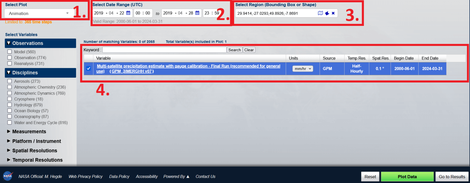
Identify the specifics of the data (see the red boxes below):
Select Story: Animation
Select Data Range: 22/04/2019 to 28/04/2019
Select Region: All of Mozambique
Select Dataset: Satellite-Based Integrated Precipitation Estimates – Final Run (Recommended for General Use) (GPM_3IMERGM v07) Units: mm/hr. Source: GPM
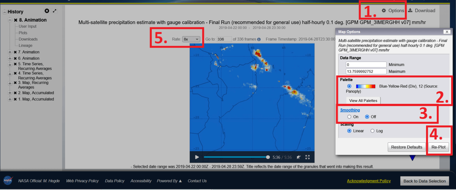
Configure:
Select Options
Select Palette: Cyan-Red-Yellow (Seq), 65
Enable Anti-aliasing
Select “Overstrip”
Set Factor to 8x
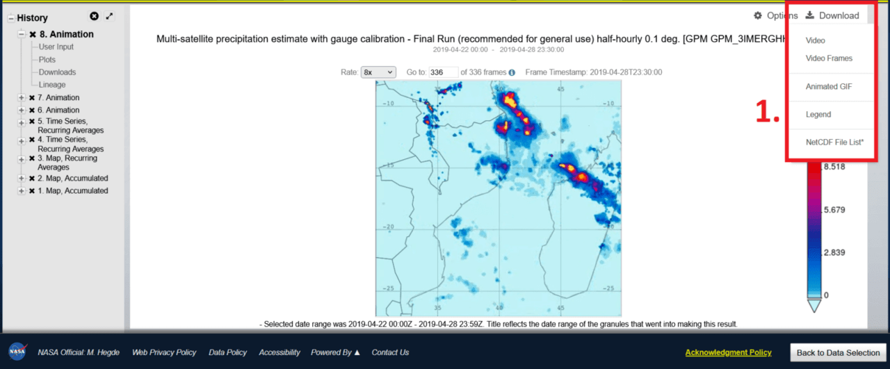
Export graphics
Select Upload and the file type. Select Video or Animated GIF.
Note: Recently, when uploading an animation, the frame rate setting of 8x was not saved, but was reset to 1x. To adjust the frame rate, open the file in a video or GIF editor after uploading and adjust the speed settings.
Final export
This animated graphic above shows rainfall estimates from multiple satellites (GPM_3IMERGHH v07) at 0.1 degree resolution and half-hourly rainfall in mm, covering the period from April 22 to 28, 2019. The animation clearly shows the path of Cyclone Kenneth, highlighting the regions with the heaviest rainfall and providing insight into its development, progression, and dissipation.
Visualization III: How much rain fell and where?
Creating a graph showing the accumulated daily average rainfall for a region helps you visualize the amount of rainfall caused by Cyclone Kenneth over several days and pinpoint the areas where the most rain fell. (This export also prepares you for the next step, which is working with the data in maps such as Google Earth Pro).
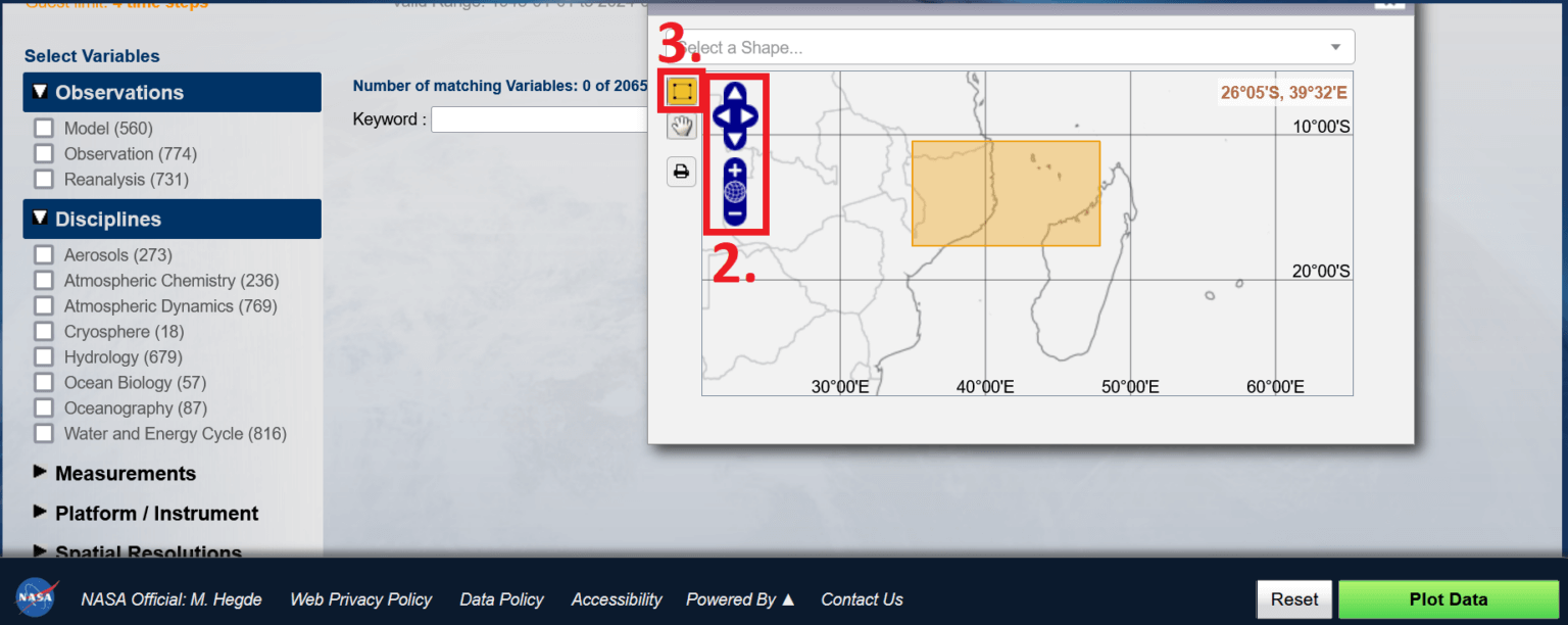
Select a region (see red boxes below)
1. Click on the map icon
2. Zoom in to Mozambique
3. Use the drawing tool to highlight Cabo Delgado and the surrounding ocean
4. Close the Region Selection window
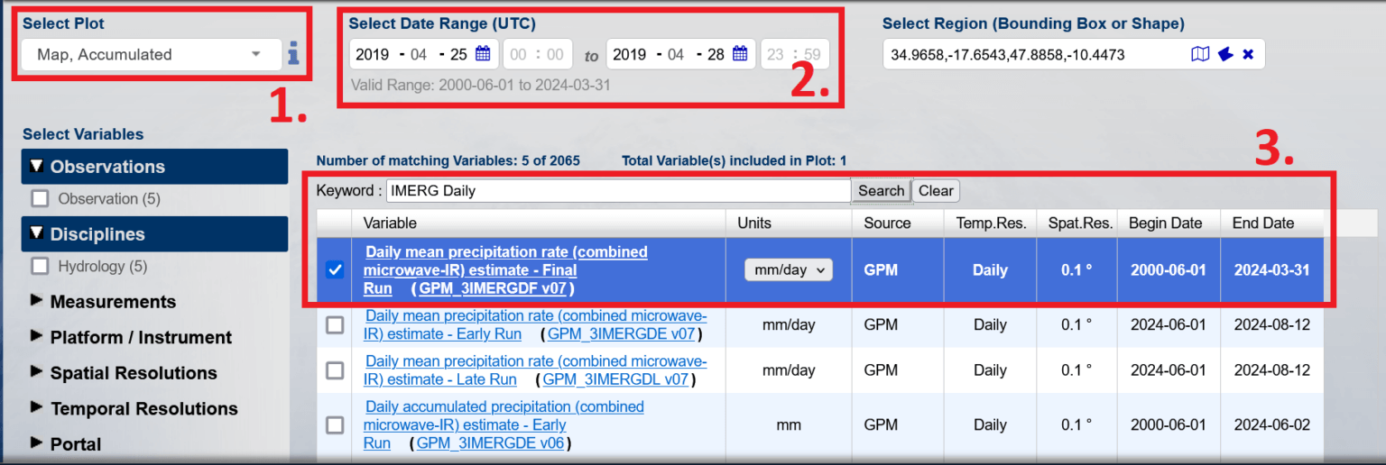
Defining data specificity:
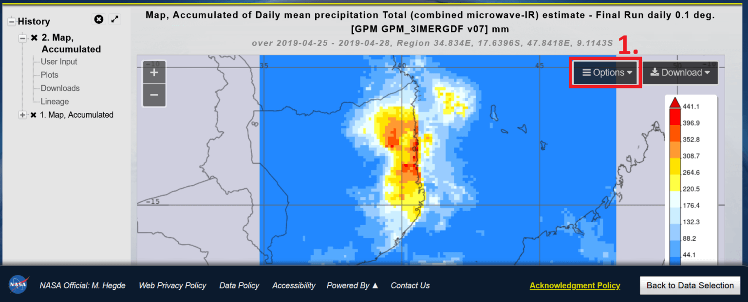
Select a graph: Map, Accumulated
Select a data range: 04/25/2019 to 04/28/2019
Select a precipitation dataset by entering the keyword in the search field: “GPM_3IMERGDF v07”. Select the average daily precipitation estimate (combined microwave and infrared) – Final run (GPM_3IMERGDF v07)
Configure:
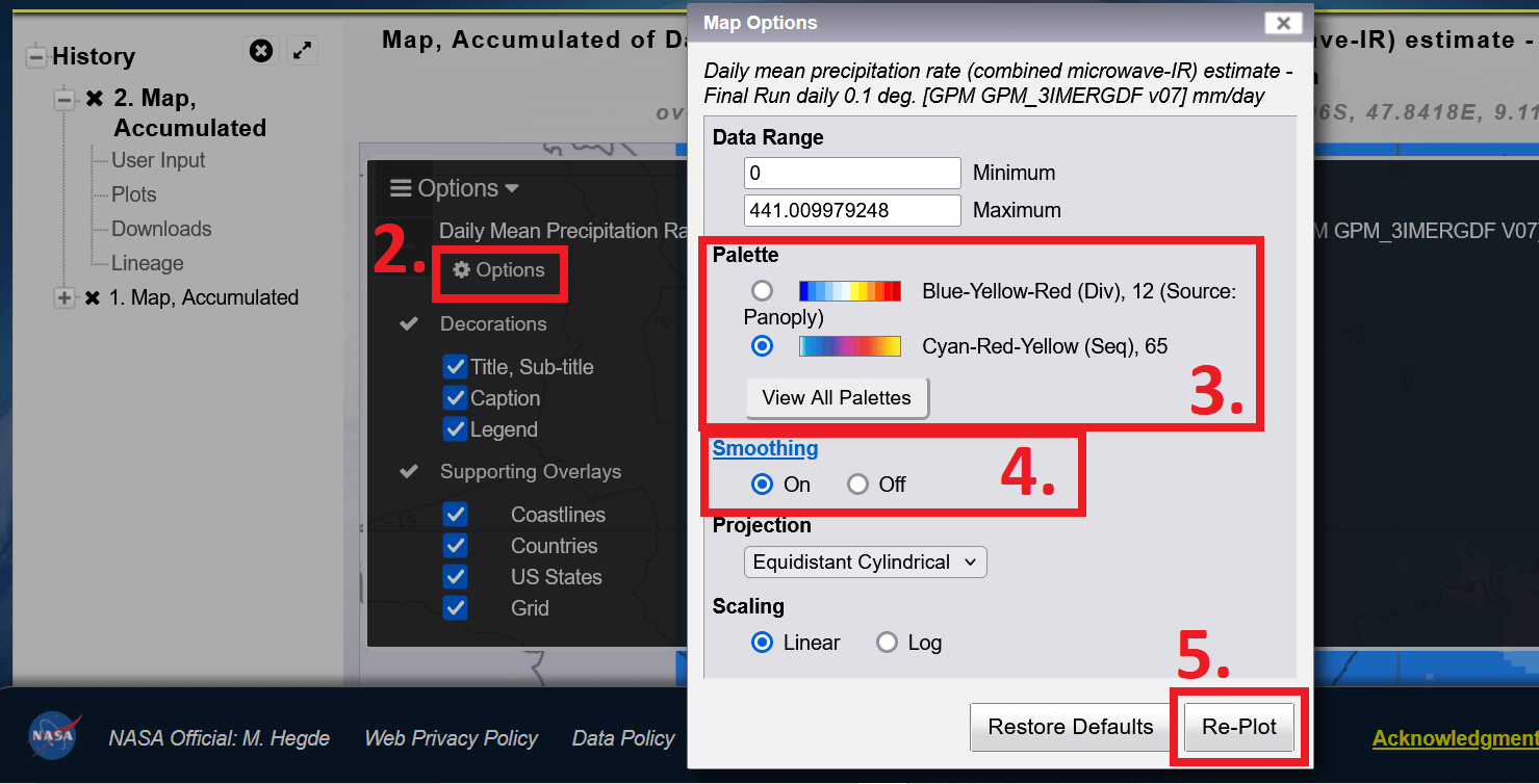
1. Select options
2. Select options in the pop-up
3. Select a palette: Blue-Red-Yellow (Seq), 65 (select “View All Palettes” to add this palette if it is not already displayed)
4. Enable anti-aliasing
5. Select “Strike Through”
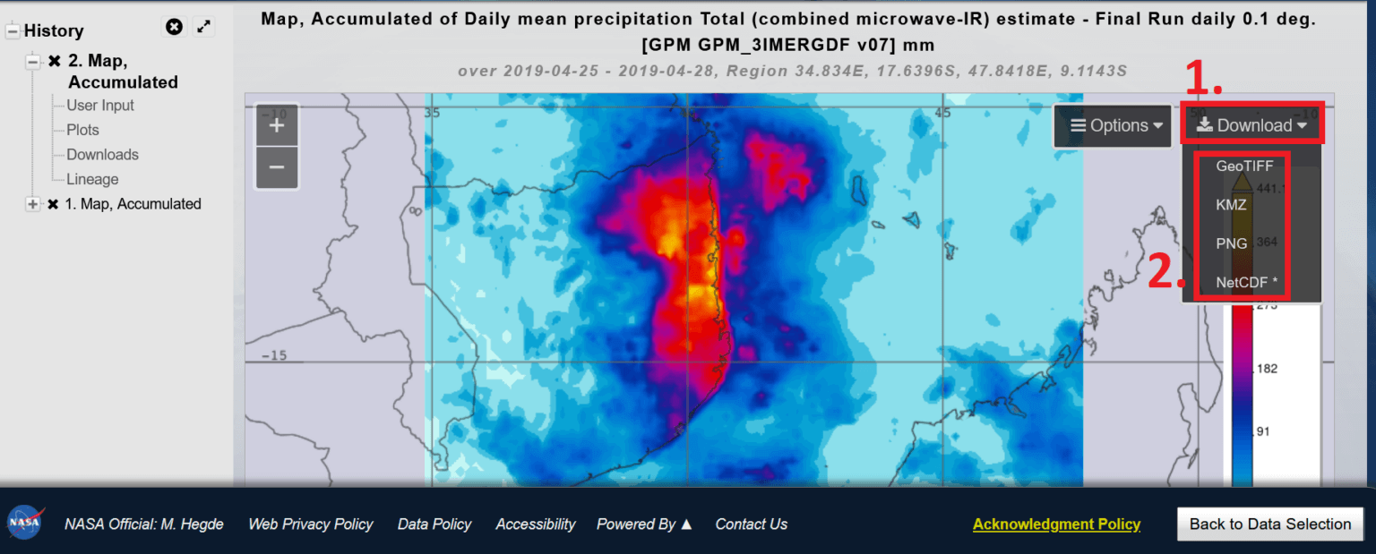
Export visualization:
1. Select “Download and export as image (PNG) or as KMZ” for Google Earth and QGIS/ArcGIS.
Final export
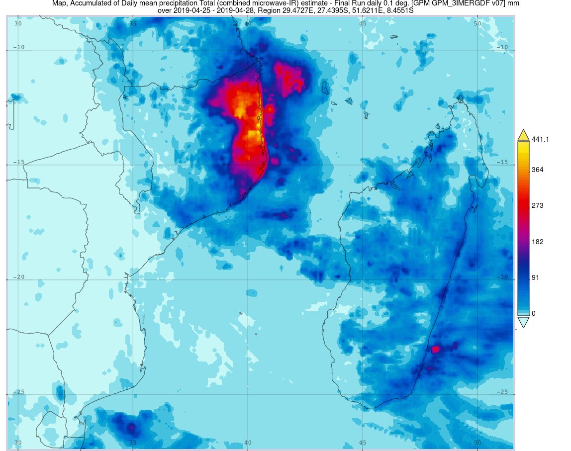
This map shows the accumulated daily average precipitation from April 25 to 28, 2019, using GPM IMERG data, which combines microwave and infrared satellite observations to estimate precipitation amounts at 0.1 degree resolution.
“Accumulated daily average precipitation” refers to the total amount of precipitation recorded each day, averaged over a period of time. This approach provides a clearer picture of the sustained intensity of precipitation rather than individual events. By visualizing this data, we can identify the regions that experienced the most precipitation, and which are often most affected by secondary hazards such as flooding and landslides.
While NASA Giovanni allows you to create graphs directly, integrating its data into mapping software provides a deeper understanding by viewing climate impacts in the context of local geography. By visualizing climate data such as precipitation along roads, settlements, and topography, you can create customized maps that show meaningful patterns.
To get started, download and install Google Earth Pro Desktop. Then, in NASA Giovanni, export the accumulated precipitation map you created earlier as a KMZ file. Open the KMZ file in Google Earth Pro. If the file doesn’t open automatically, open Google Earth Pro Desktop and drag the downloaded KMZ file anywhere on the map.
Configure: (see red boxes below)
Select the attached file.
Select the icon to adjust the opacity and set the layer to transparent.
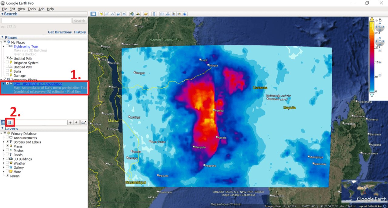
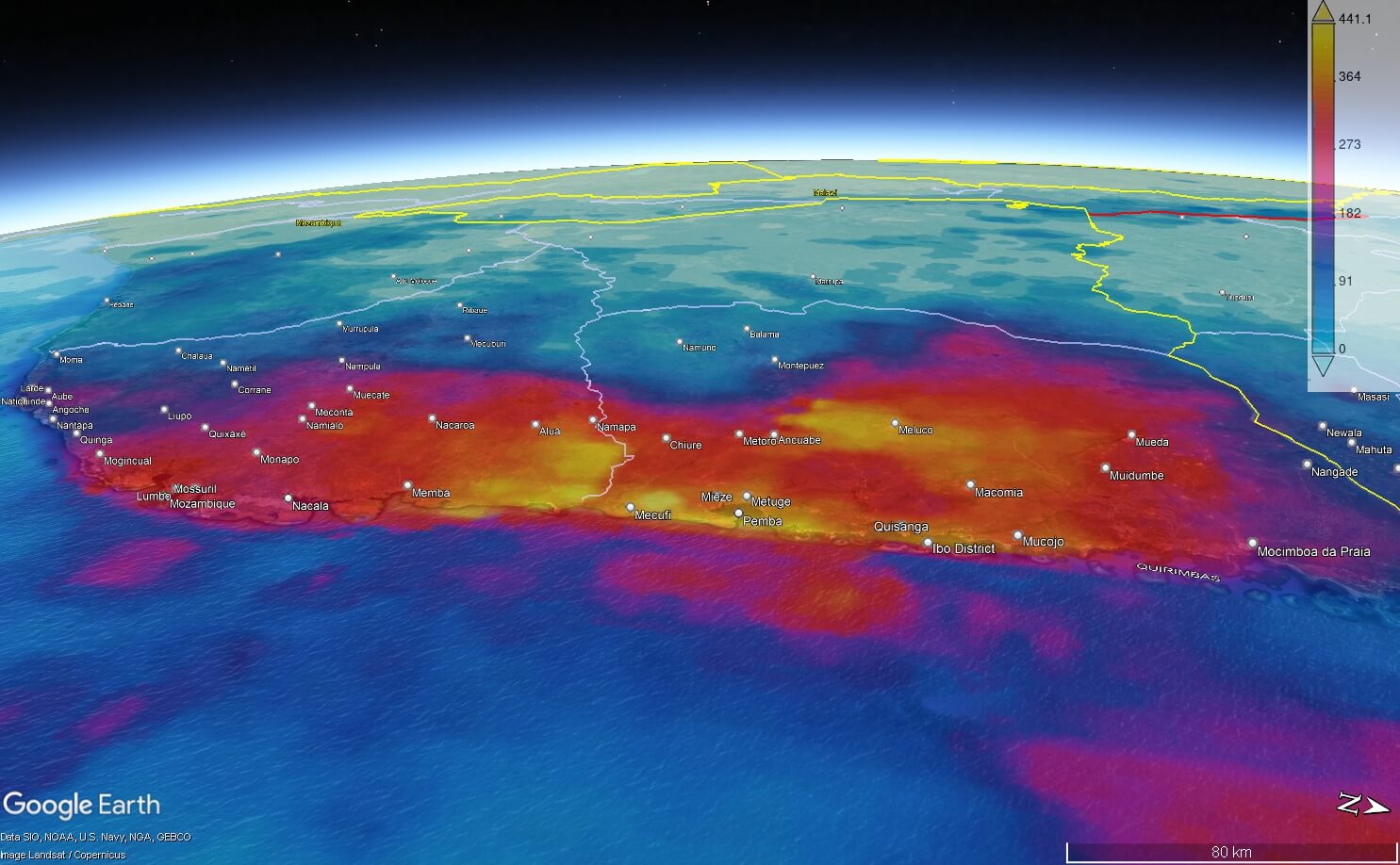
To export, use your mouse cursor to adjust the view. Finally, select the “Save Image” icon to export the map view as an image file.
Final export:
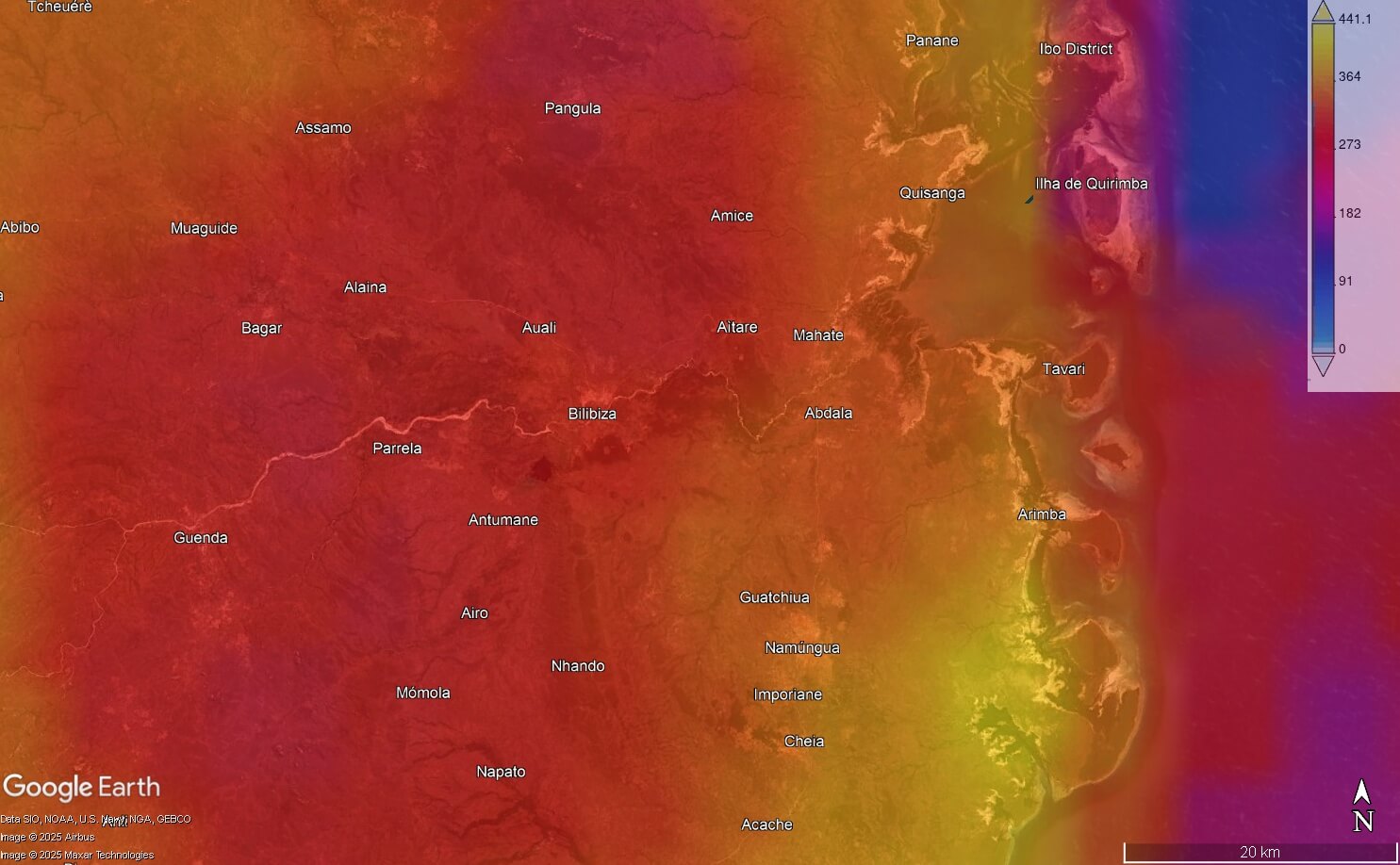
Visualizing the accumulated precipitation layer in Google Earth Pro brings the data to life by showing how precipitation patterns interact with the landscape. The overlay clearly shows how precipitation intensity increased as rain clouds moved inland from the coast, revealing the influence of topography and weather systems.
By overlaying the data along roads, settlements, and natural features, it becomes easier to see which areas experienced the most rainfall and potential flooding. This added context turns raw climate data into a powerful tool for understanding and communicating impacts on communities and infrastructure.
Visualizing climate events is not just about creating maps, it’s about making sense. With simple and accessible tools like NASA Giovanni, everyone—from researchers and journalists to aid workers—can use data to tell these urgent stories.
If you want to dive deeper into climate data and visualizations, check out these valuable resources:
Copernicus Climate Data Store: A hub for high-quality climate datasets, including historical data, forecasts, and impact assessments.
European Space Agency (ESA) Climate Change Initiative: Satellite-based climate observations covering essential climate variables.
NASA Worldview: An interactive platform for real-time satellite imagery, helping visualise weather events, wildfires, floods, and more.
NOAA Climate Data Online (CDO): Access a wide range of U.S. and global climate data, including storm events, temperature records, and drought indices.
IPCC Interactive Atlas: Climate projections, historical data, and regional impacts from the Intergovernmental Panel on Climate Change.
Global Precipitation Measurement (GPM) Mission: Real-time and historical global rainfall data, perfect for mapping storm impacts.
These platforms offer free and accessible data to help you go beyond the surface and tell richer, data-driven stories about climate hazards and their human impacts.