19.07.2025
11 min
791

This article shows how to visualize conflict, displacement, and the effects of natural disasters using Google Earth, satellite imagery, OpenStreetMap, and ACLED data. It provides a practical approach to analyzing violence, population displacement, and spatial change. It is ideal for journalists, analysts, and anyone working with open data.
Extreme weather events are increasingly forcing millions of people from their homes. Last year, floods and storms displaced more people worldwide than war or violence.
Climate change can also indirectly increase conflict risks, causing food insecurity and competition for resources.
Therefore, analyzing trends in both climate and conflict data is critical not only for humanitarian response teams, but also for journalists and researchers seeking to understand the complex impact of weather hazards and violence on displaced communities.
In the first part of “The Story of One Storm,” we showed you how to transform raw climate data into visualizations using NASA’s Giovanni tool and plot them on a graph using Google Earth Pro Desktop.
In the second part, we’ll focus on conflict and displacement data.
Using event data from the Armed Conflict Location and Event Data Project (ACLED) and geospatial information from OpenStreetMap (OSM), we will further analyze our case study from part one – Cabo Delgado, a coastal province in northern Mozambique.
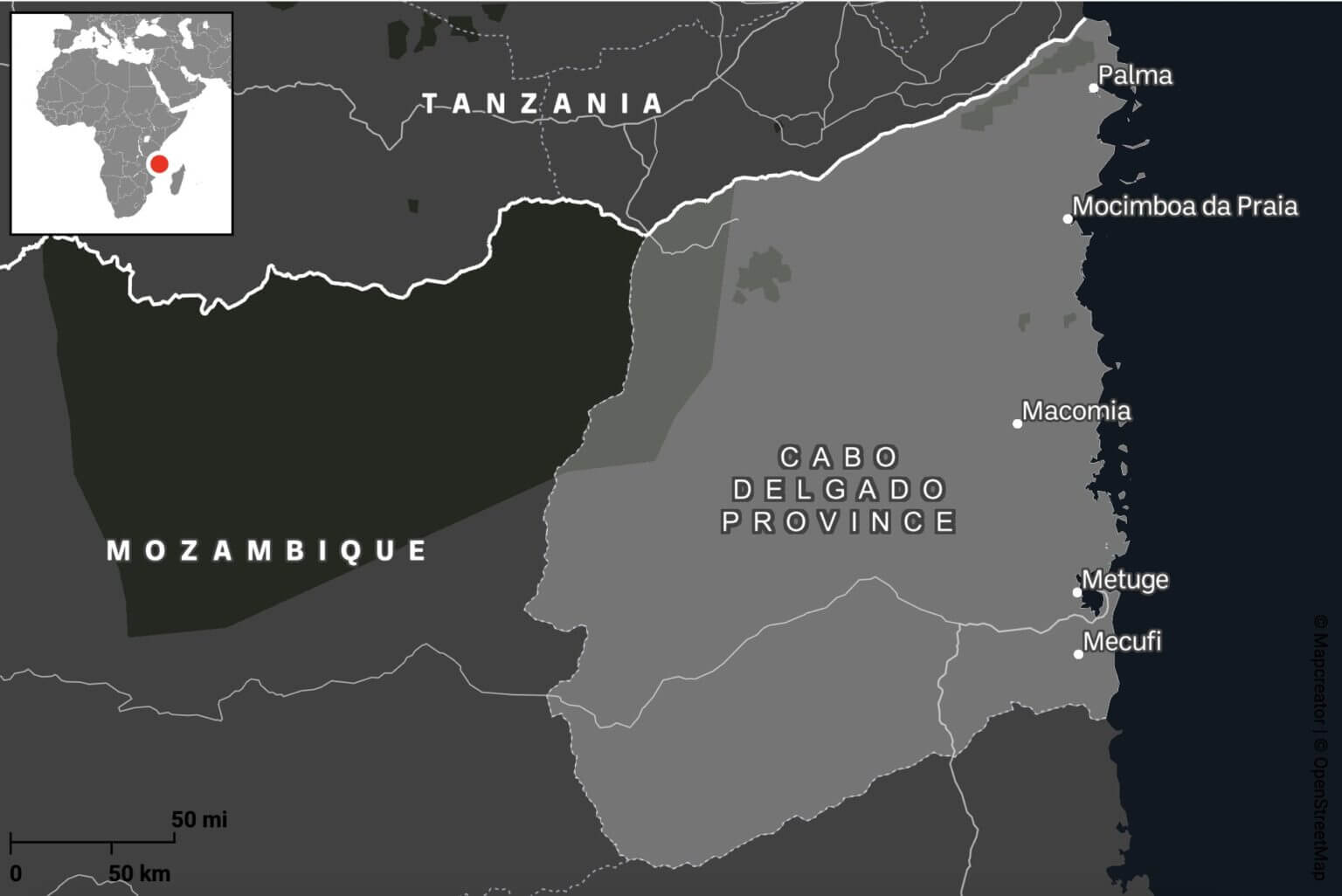
Cabo Delgado is a region beset not only by cyclones but also by years of conflict. What began in 2017 as a series of localized attacks by Islamist militias has since escalated into an ongoing regional civil war between government forces and the Islamic State of Central Africa Province (ISCAP). Nearly a million people have been displaced, and extreme weather events, including Cyclone Kenneth in 2019 and Cyclone Gombe in 2022, have only exacerbated the unfolding humanitarian catastrophe.
Step 1: Obtain conflict incident data
Armed Conflict Location and Event Data (ACLED) provides real-time monitoring of global political violence and unrest, providing geo-referenced records of protests, riots, and violence directed against civilians.
Most of ACLED’s data comes from publicly available sources, including local media reports and social media posts, making it highly dependent on the presence or absence of local journalism. This reliance can create gaps in the data. However, ACLED may also occasionally gather intelligence from local partners on the ground.
Each event record contains key attributes such as dates, locations, people involved, number of victims, and event descriptions. The data can be downloaded as CSV files with XY coordinates for spatial analysis. It is important to understand that these coordinates often reflect approximate locations, often defaulting to the nearest city center rather than the exact location, which reduces the spatial accuracy of detailed analysis.
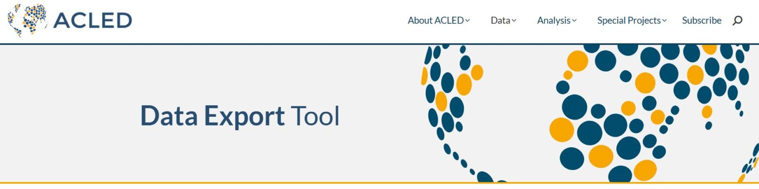
To download ACLED data in CSV format, you will first need to create a free account. You will then need to generate an access key before proceeding to the data export tool.
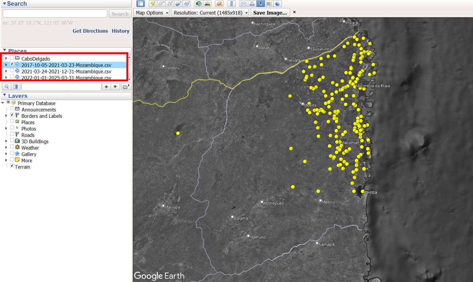
Given the complexity and duration of the conflict in Cabo Delgado, which dates back to 2017, we have decided to divide the data collection into three distinct time periods, as described below. A separate CSV file will be created for each period, which, when uploaded to Google Earth Pro, will generate a separate data layer on the map.
Each time period reflects the changing levels of violence and the resulting patterns of community displacement over time.
Period 1. 5 October 2017 – 23 March 2021: Gradual displacement.
The first attacks begin in the northern areas. A steady stream of internally displaced persons (IDPs) arrives further south, in and around Metuge.
Period 2. 24 March 2021 – 31 December 2021: Peak displacement.
A large-scale attack on the city of Palma in March 2021 displaced over 100,000 people.
Period 3. January 1, 2022 – present: post-peak.
Following the recapture of Palma and Mocimboa da Praia by Mozambican and allied forces, some IDPs have begun to return to their homes.
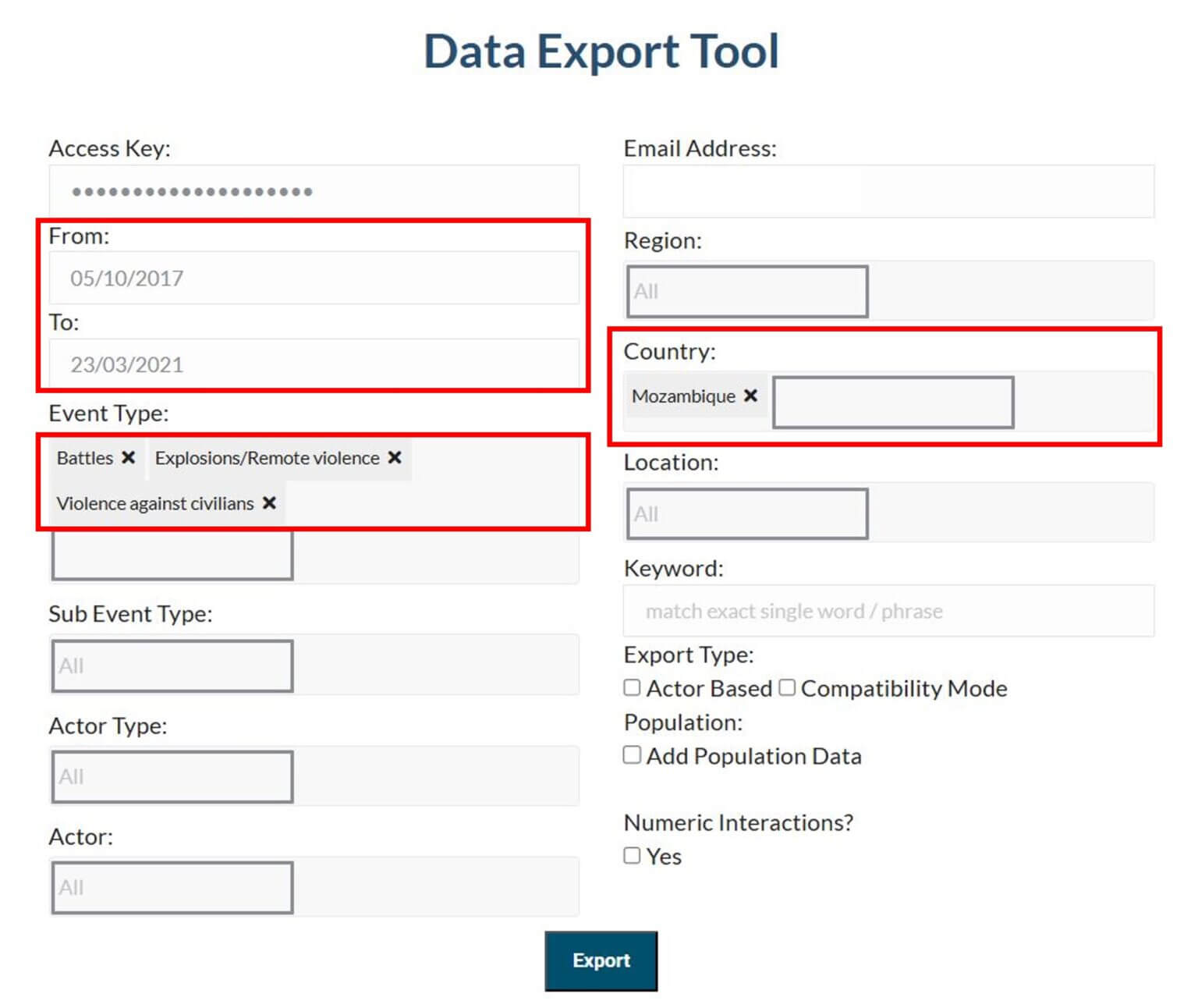
To export your data, go to the Data Export Tool and enter the following information, repeating this step for each time period:
Event Type: Battles, Explosions/Remote Violence, Violence against Civilians
Country: Mozambique
Date Range (from and to):
05/10/2017 – 23/03/2021 (Period 1: Gradual Movement)
24/03/2021 – 31/12/2021 (Period 2: Peak Movement)
01/01/2022 – Today (Period 3: Post-Peak)
Step 2: View Conflict Data in Google Earth Pro
Launch Google Earth Pro on your desktop. From the top menu, click File → Import.
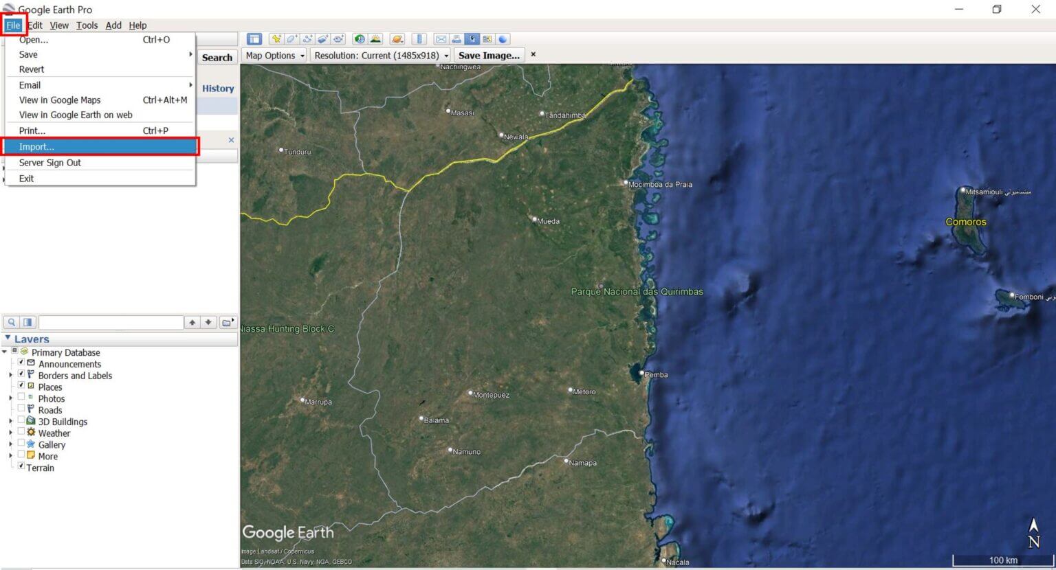
Browse to one of the downloaded ACLED CSV files and select it. The “Data Import Wizard” pop-up window will appear.
Select the field type: Delimited. Select comma as the delimiter.
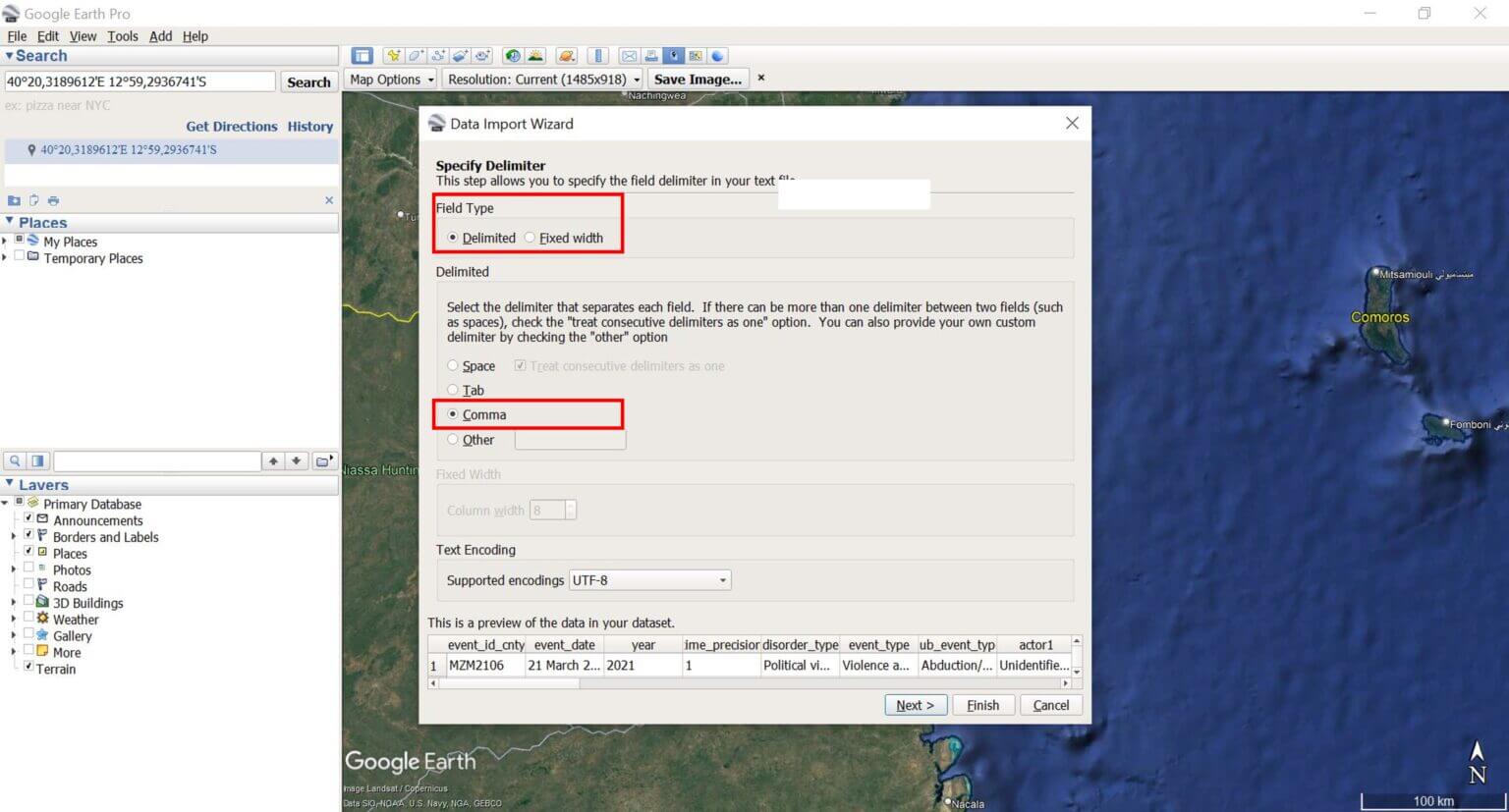
Click Next and leave the other settings as they are (make sure the Latitude and Longitude fields are selected correctly). Click Finish to import the file.
Step 3: Save and Style the Data
A new layer will appear under Temporary Locations, and Google Earth Pro will automatically display the imported points on the map. If they are not displayed, make sure the check box next to the layer is selected.
Right-click on the dataset and select “Save As…” to save it as a KML or KMZ file.
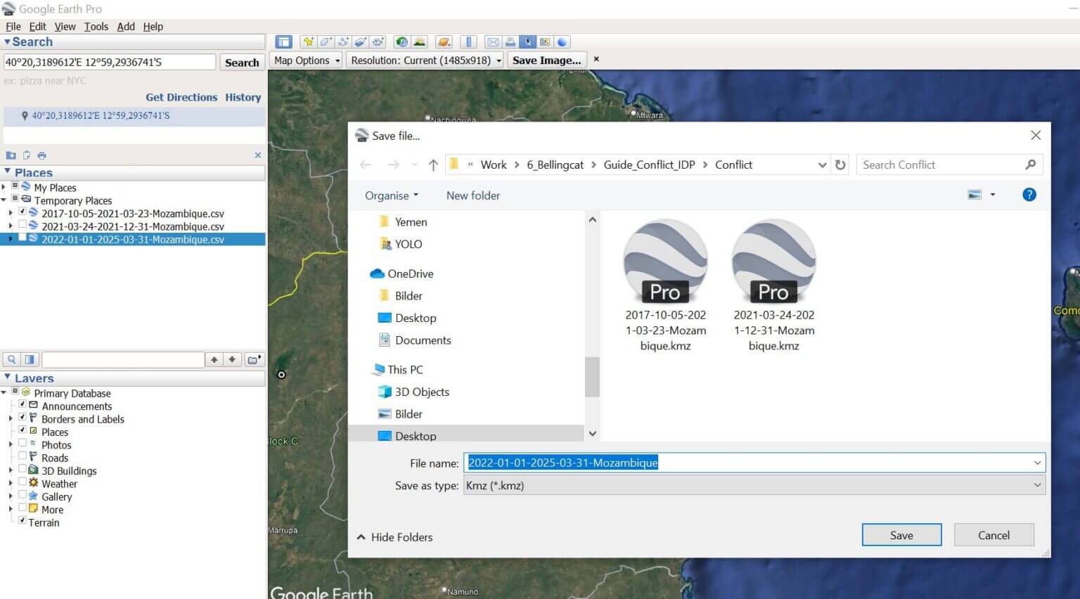
Repeat steps 2 and 3 for all of the ACLED CSV files you downloaded.
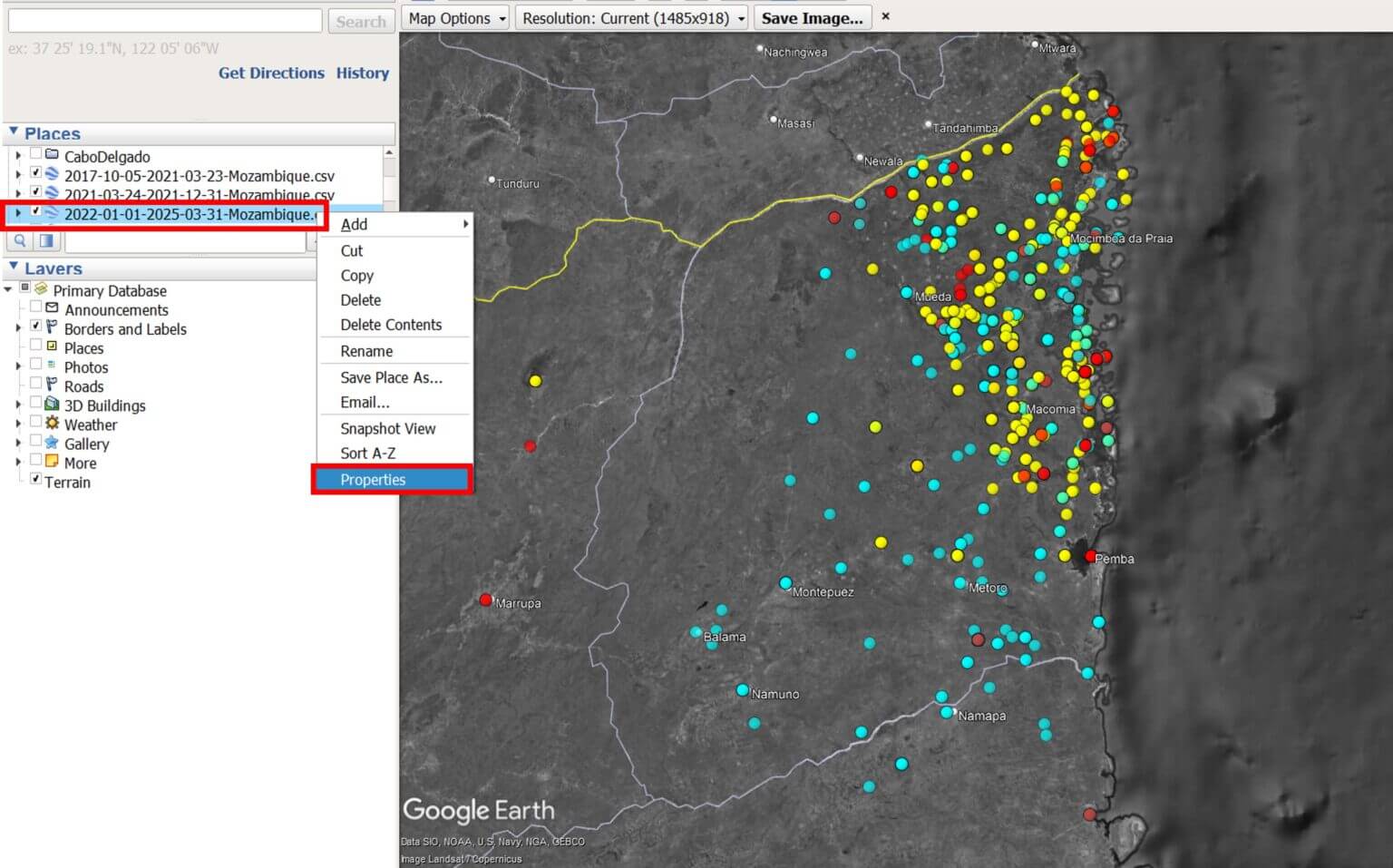
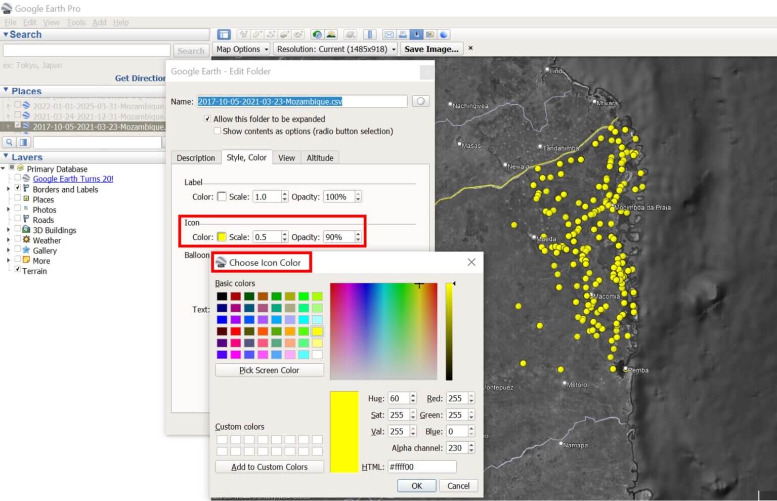
To change the icons or colors, right-click the layer file, select Properties, and change the style/color settings.
Step 4: Data Exploration
Click on any point to view event details, including date, type, and location.
Keep in mind that ACLED may record multiple conflict incidents in the same location, so events may appear together on the map.

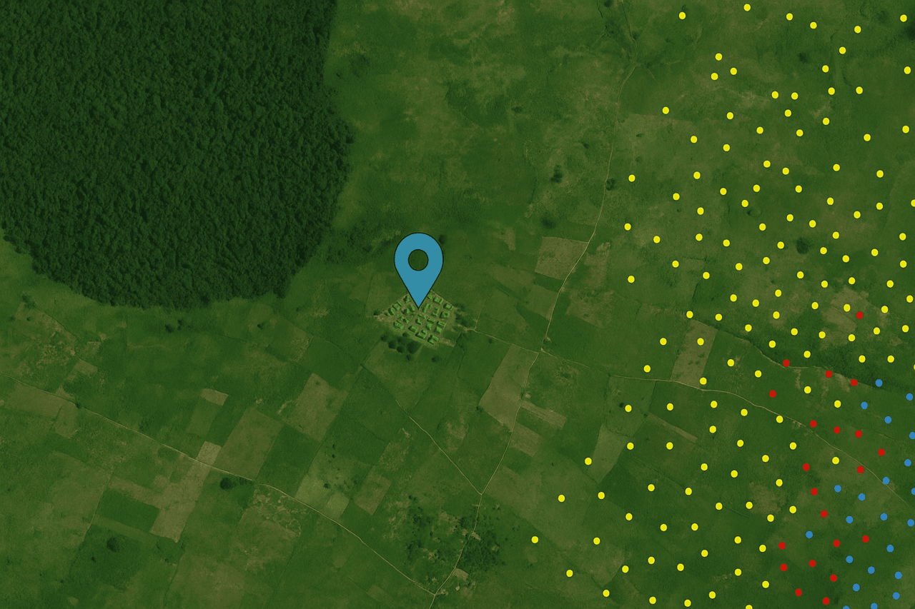
Вмикайте та вимикайте шари часових періодів для аналізу просторово-часових змін у моделях конфліктів.
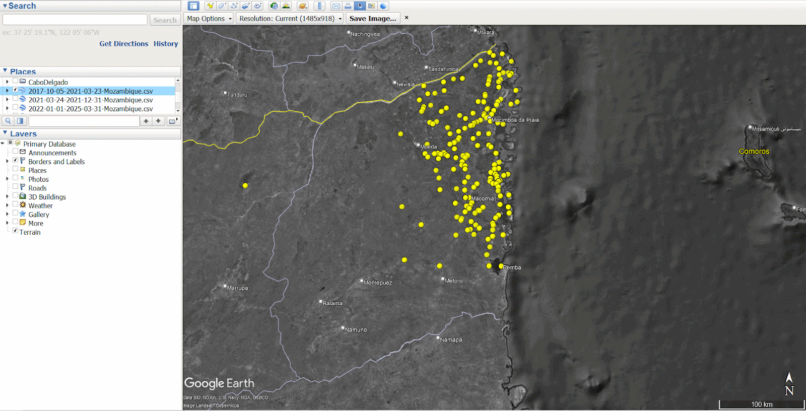
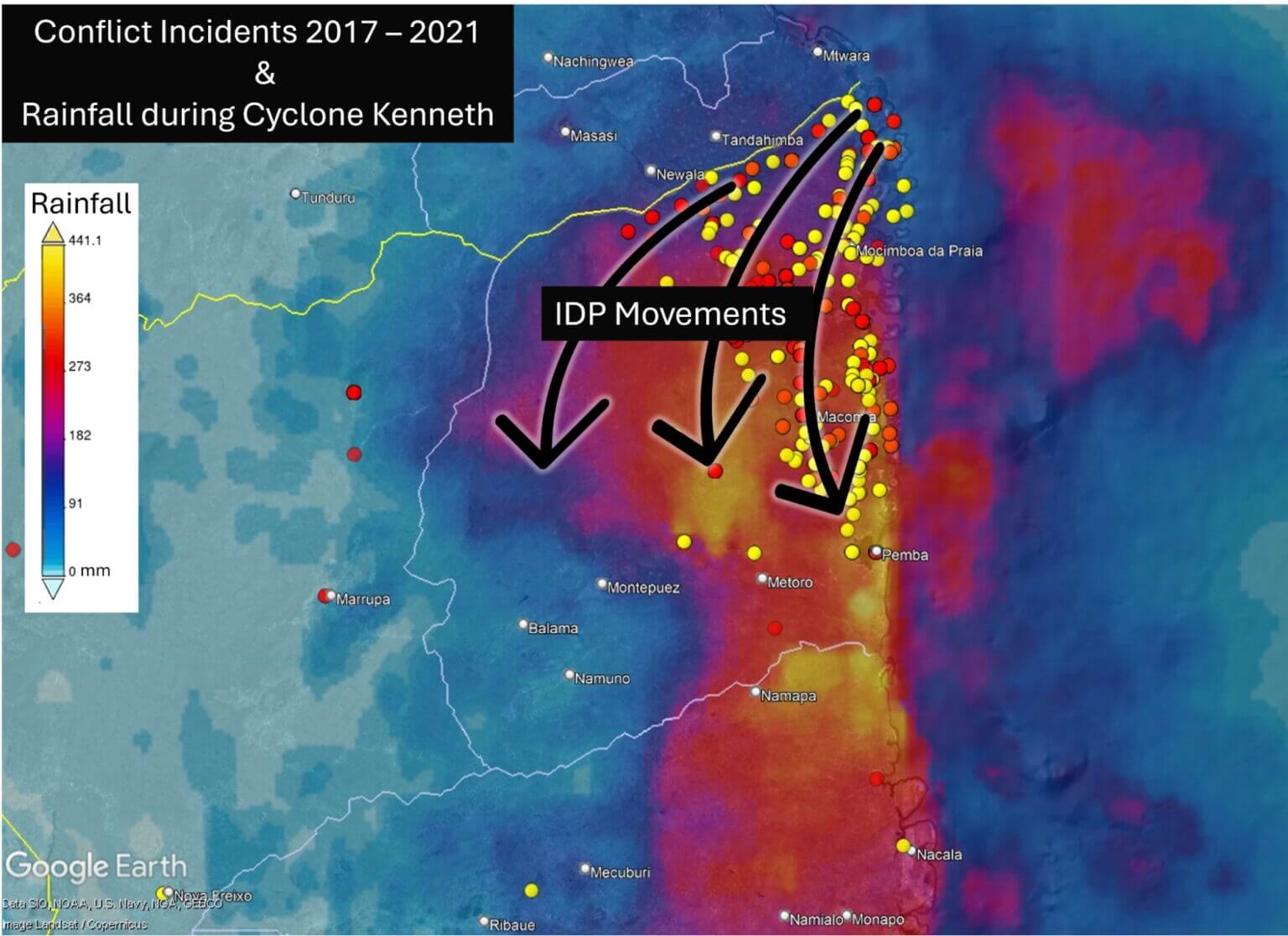
The visualization shows that during the first period, the gradual displacement (yellow), the violence was concentrated mainly in the northeast of Cabo Delgado, in the areas of Macomia, Mosimboia da Praia and Palma. During the second period, the peak of displacement (red), the number of incidents in the northeast remained high, leading to a large influx of IDPs into the Metuge region. By the third period, after the peak (blue), the conflict had spread further south and west, increasing the risk of re-displacement for the population already displaced.
To better understand local patterns of displacement, we can begin to identify specific IDP settlements of interest using high-resolution satellite imagery.
The Copernicus Emergency Mapping Service (EMS) conducted a satellite assessment of Cabo Delgado in 2021, identifying and mapping 27 IDP settlements across the province.
The EMS’s mission, which is to provide maps and geospatial data in near real-time during or immediately after a critical event, aims to help services make informed decisions quickly. Recent responses have included forest fires in Portugal, floods in Germany, or landslides in Ethiopia. You can access their full database here.
The EMS was activated over Cabo Delgado in response to the displacement of thousands of civilians after militants attacked and killed dozens of people in the coastal city of Palma. The map below shows seven IDP settlements captured by the EMS in 2021 in the areas of Metuge and Mekufi.
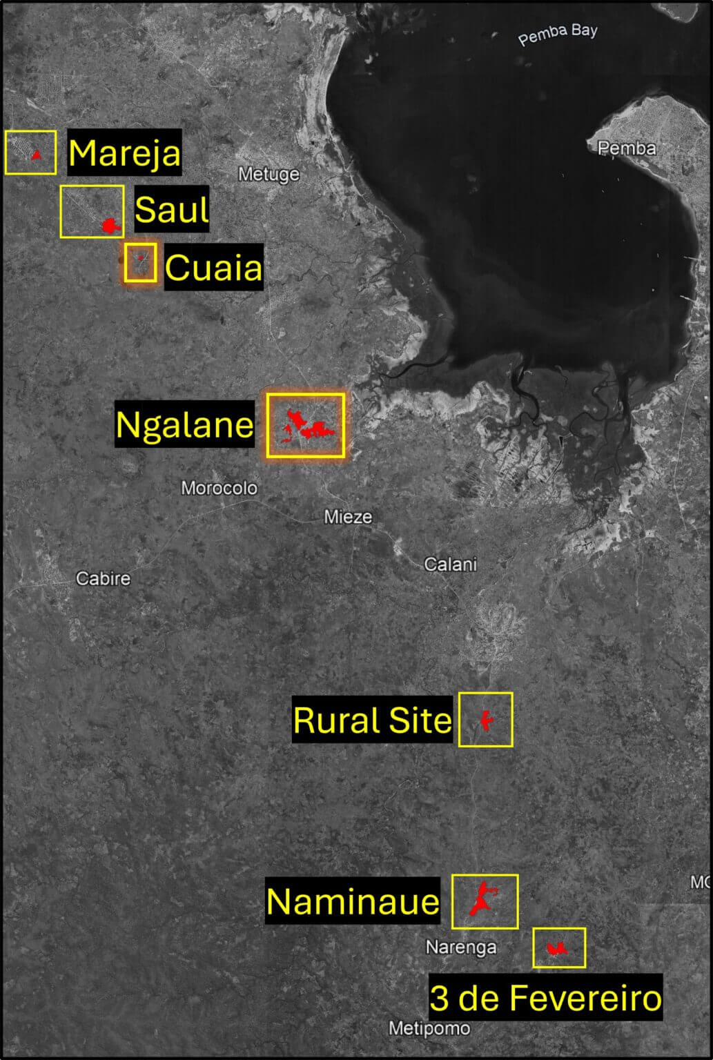
Based on EMS data, we will focus on two of the seven settlements: Kuaya (40°21’E 12°59’50″S) and Ngalane (40°23’50″E 13°2’46″S).
The Copernicus Environmental Management System provides detailed guidance on what to look for when analyzing a potential IDP settlement, including types of housing, tents and other structures. Follow this link to download the PDF file titled “Technical Report”.
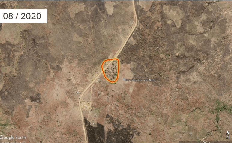
As seen in the satellite images below, an organized camp with tents and sanitary facilities to the west of the small village of Kuaya was visible in May 2021. However, by May 2022, all tents had disappeared, indicating that this was a temporary location that had not been transformed into a permanent IDP settlement.
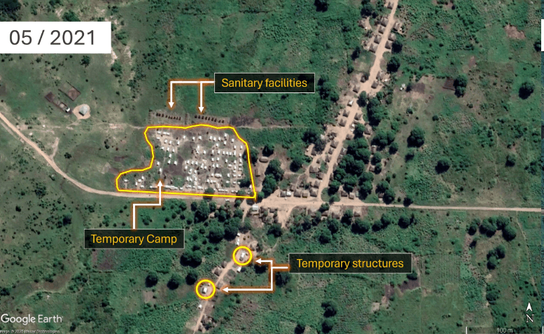
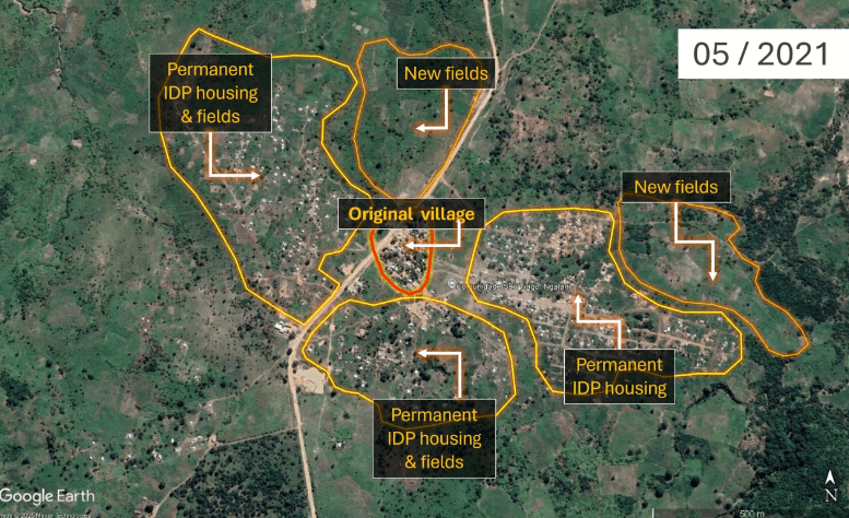
Image of Kuayya (40°21’E 12°59’50″S) in May 2021 and May 2022. Source: GoogleEarthPro 2025
The light-colored roofs of the tents, their uniform size and shape, indicate that this settlement was temporary. Their neat arrangement in tightly spaced rows suggests that the camp was established by a humanitarian organization. Just north of the tents, two rows of small, dark structures, most likely sanitary facilities, are also visible. Their location relative to the camp further supports the interpretation that this is a planned, non-permanent installation, distinct from the neighboring village to the east. Two buildings have appeared in the southern part of the image. A change in the color and material of their roofs can be observed between 2021 and 2022, indicating a transition from temporary to more permanent construction.
Ngalane – A Permanent Settlement
Located south of Metuge town, the expansion of Ngalane is clearly visible in satellite imagery – from a small community in 2020 to a larger, more established location by 2021. The noticeable increase in residential area and agricultural land indicates that Ngalane has transformed from a temporary location to a permanent settlement for IDPs.
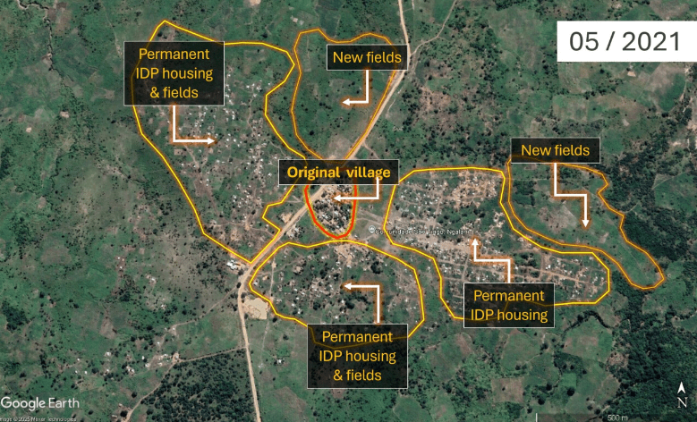
Images of Ngalane (40°23’50″E 13°2’46″S) in August 2020 and May 2021
Instead of the organized, grid-like layout seen in temporary sites such as Kuaya above, the organic arrangement of dwellings in Ngalane, complete with informal footpaths, small roads, newly established small fields, and cultivated areas, suggests a level of permanence. While some buildings still have light roofs, suggesting the presence of canvas tents, the overall spatial organization of the settlement, combined with the presence of cultivated land, is more evidence of a transition from short-term displacement to long-term settlement, reflecting efforts to rebuild livelihoods.
Analyzing the Digital Footprints of Settlements
Now that we have identified two locations of interest, we can further analyze the structure of settlements and the impact of their populations on climate hazards using building area data from OpenStreetMap (OSM). OSM is a collaborative project that provides free, crowdsourced geographic data, including information about roads, buildings, and other infrastructure.
Settlement area data is based on the number, size, and shape of individual buildings and can be used to estimate the number of people living in a given area. Such data can be used for impact mapping, which helps determine the location, its density, and the resilience of its structures to climate hazards such as floods, droughts, or cyclones.
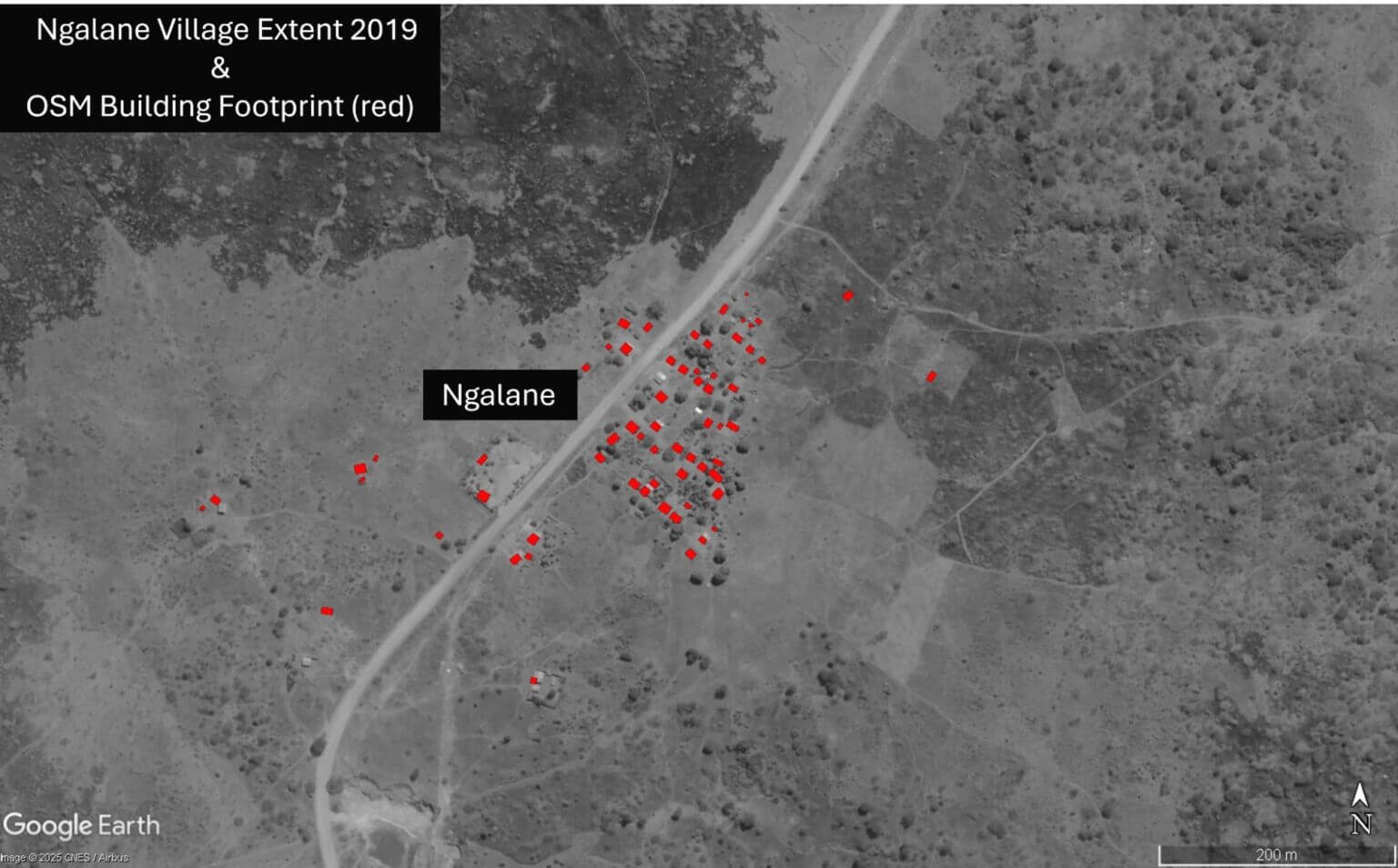
Ngalane – Incomplete Footprint
To see the current OSM building area in Ngalane, you first need to create a free account.
By switching to the iD editor window, we can see the OSM map of the original village (circled in red) before the large influx of IDPs was mapped. The red rectangles indicate the buildings that are currently recorded in OSM.
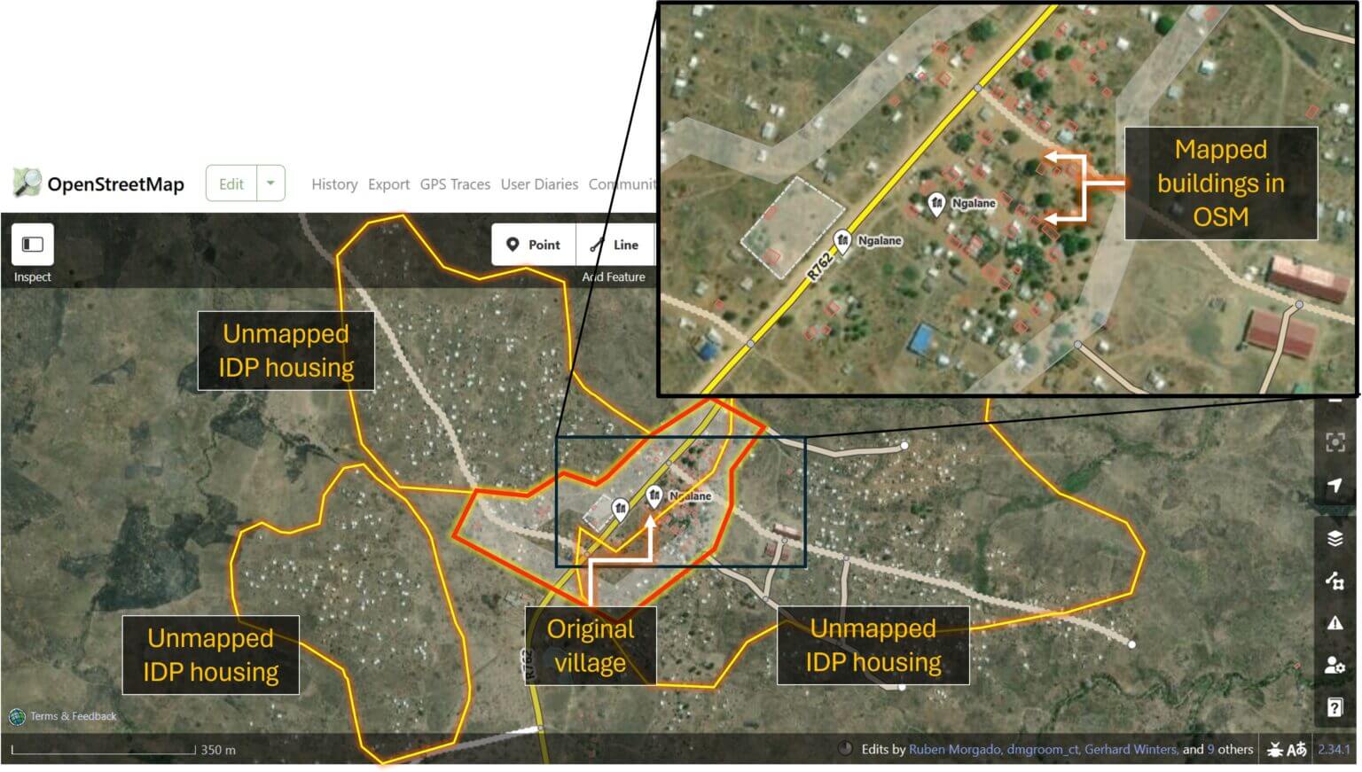
However, outside the old village, newer settlements where IDPs live remain completely unmapped and therefore undocumented. In the event of a future storm or other climate hazard, the lack of mapping data for this community could result in its exclusion from impact assessments and early response planning.
In Kuaya, 83 original village buildings have been mapped in OSM. None of the temporary structures have been documented, as they only existed for a short time in 2021. However, comparing the OSM data with more recent satellite imagery from 2025, it becomes clear that the settlement is outdated: some buildings no longer exist, while others remain unmapped.
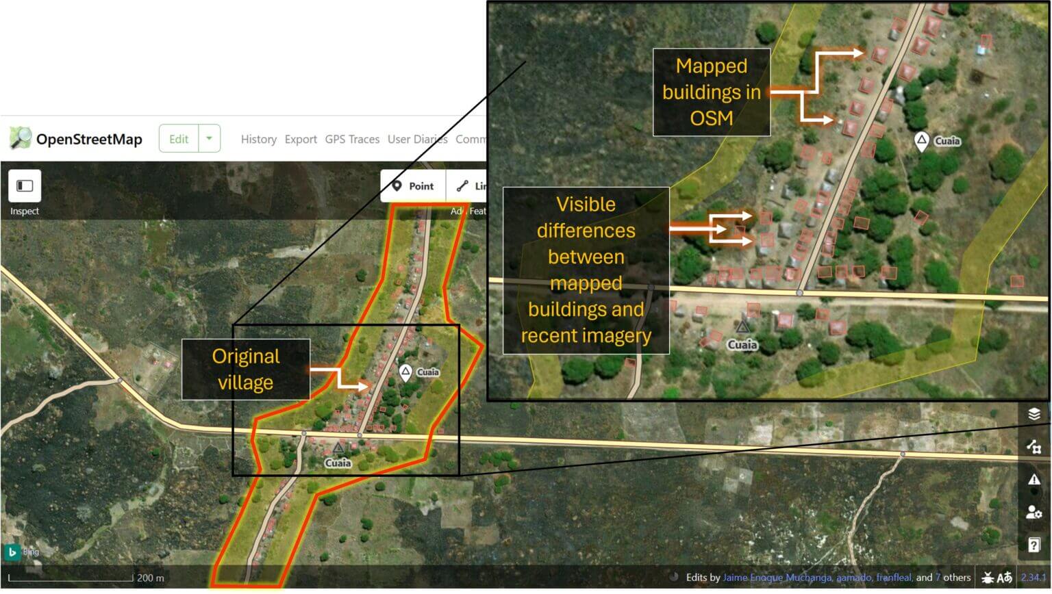
OSM metadata shows that most of the buildings were mapped between 2017 and 2019. If the data were needed for accurate impact assessments, such as in the event of a cyclone or flood, OSM building contours would need to be updated quickly.
To address such urgent situations, the Humanitarian OpenStreetMap Team (HOT) is organizing rapid open mapping for crisis-affected areas. HOT is a global initiative that mobilizes volunteers to help create real-time geospatial information by tracing buildings, roads, and rivers in OSM. Its export tool also allows users to select an area of interest and download their own extracts of OSM data, including building contours, road networks, or land use, in a variety of formats for geospatial analysis.
To overlay settlement footprints on conflict and climate data, we first export the corresponding OSM layers using the HOT Export Tool and then import them into Google Earth Pro for analysis.
Before following the steps below, you will need to create a free HOT account.
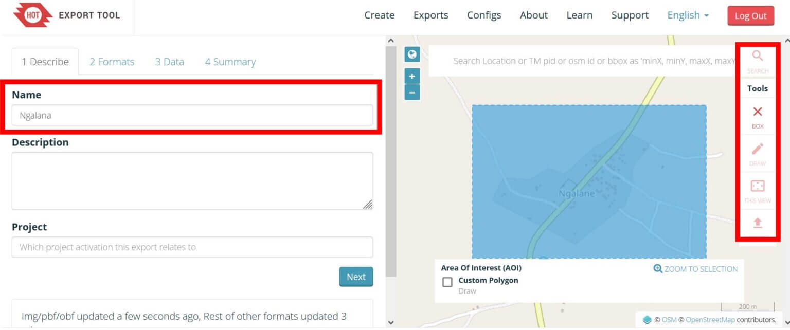
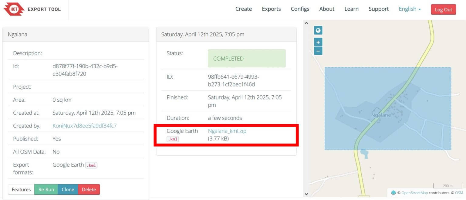
Step 1: Open the HOT Export Tool. Enter a name for your dataset, then navigate to the area of interest, such as Ngalane. Using the toolbar on the right, select the Block tool and click and drag a rectangle over the area you want to export data for.
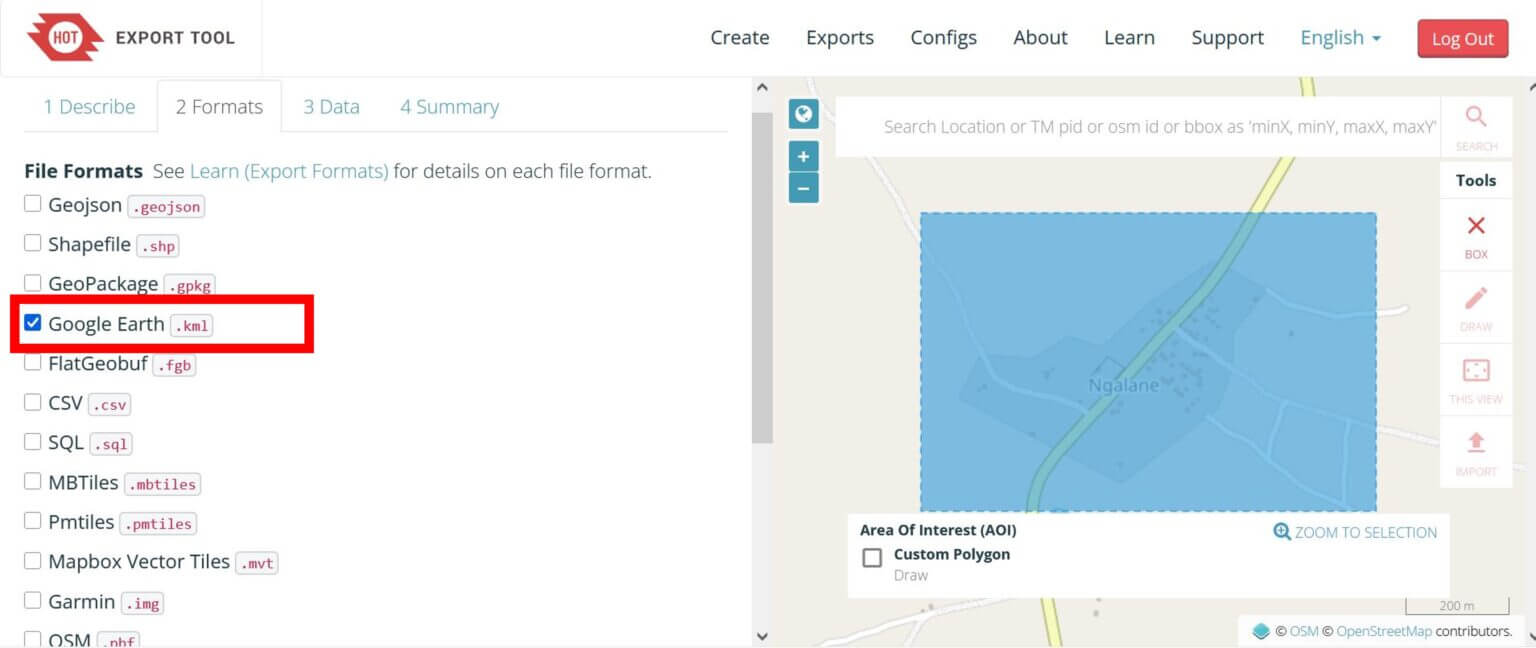
Step 2: In the Formats tab, select Google Earth .kml, then click Next.
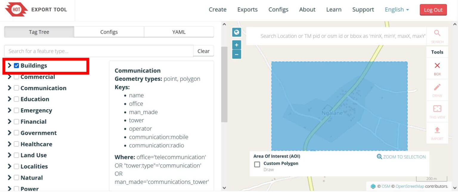
Step 3: Check the Buildings box to export all building contour data for the selected area. Click the Next button.
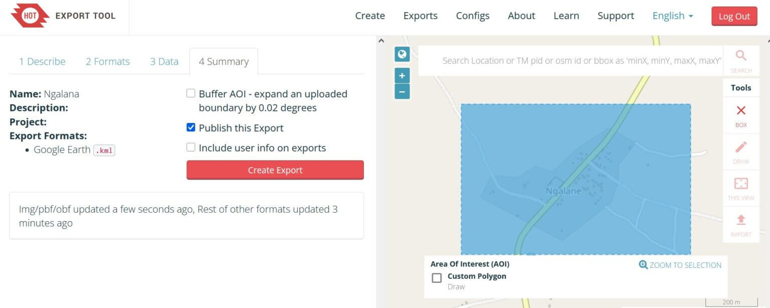
Step 4: Click “Create Export.”
Step 5: Once the status shows “Completed”, click the download link to save the data as a zip file.
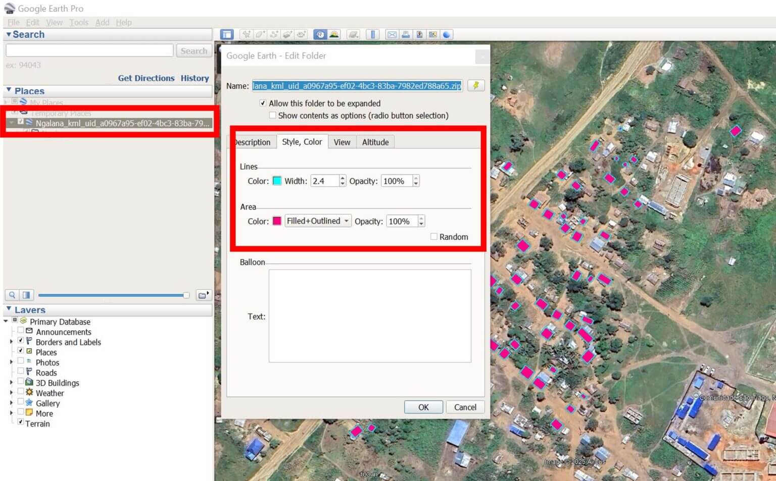
Step 6: To import the data into Google EarthPro, drag the .kml file directly into the program or go to File -> Import -> and then select the downloaded file. After importing the data, right-click on the layer in the left panel, select Properties, and on the Style, Color tab, adjust the appearance of the building data on the map.
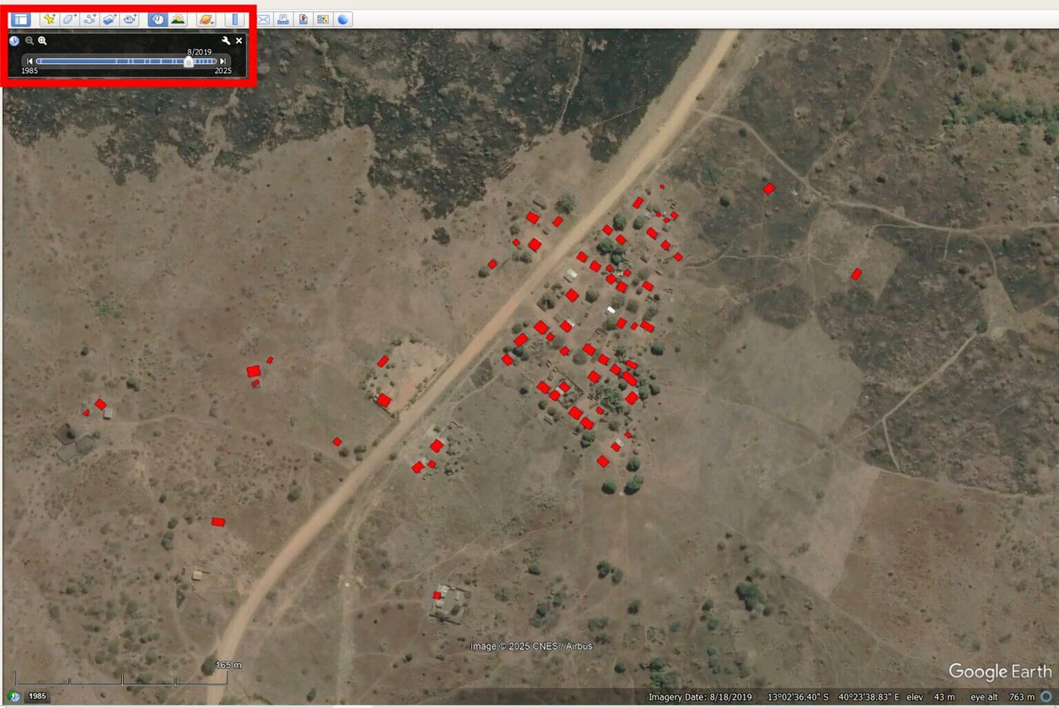
By visually comparing the distribution of buildings on the map with satellite imagery in Google Earth Pro, you can assess the completeness and accuracy of OSM mapping in your area of interest. You can also explore historical satellite imagery with the Time-Tool to track changes in building area over time and better understand how a settlement has developed.
Overlaying climate data
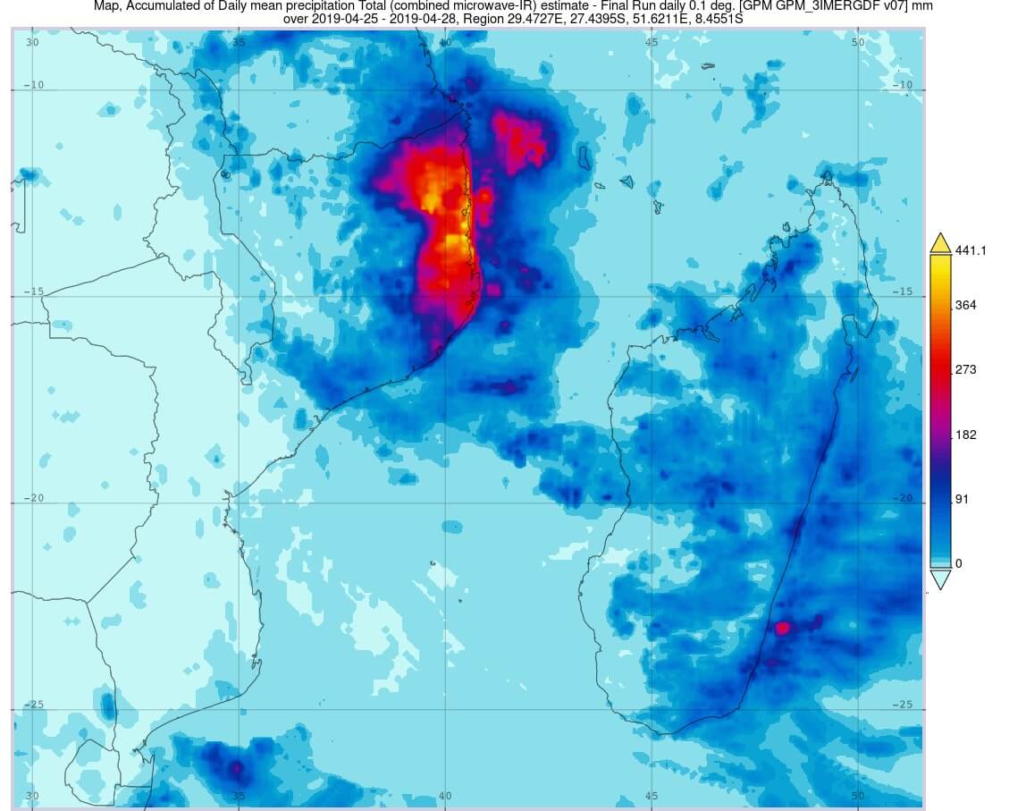
By combining ACLED’s conflict incident data (2017–2021) with Google Earth Pro’s accumulated rainfall data, we can see how violence centered in the northwest was the primary driver of displacement both before and during Cyclone Kenneth. However, the movement south brought many directly into areas affected by severe flooding.
Zooming in on our example of the Ngalane settlement further shows the high level of impact of Cyclone Kenneth on this community, including heavy rains and flooding.
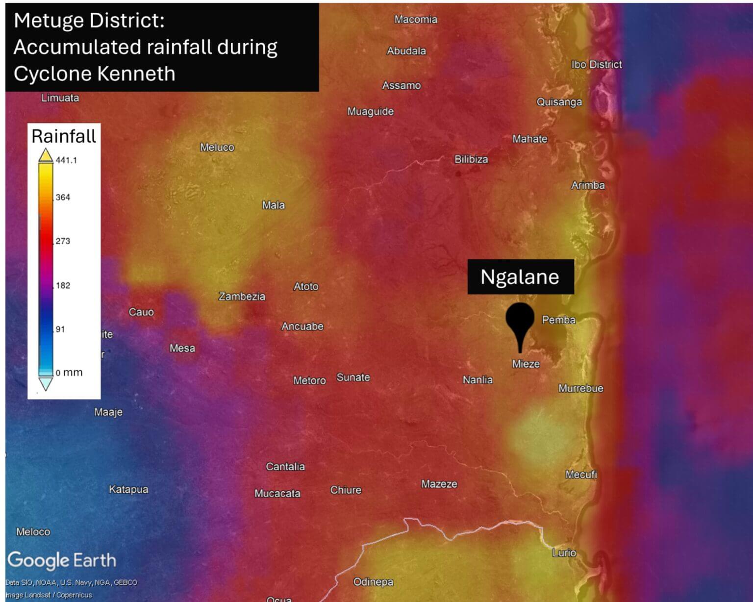
With at least 63 houses visible in the Ngalane area under OSM control, we can estimate the minimum number of residents at the time of Cyclone Kenneth’s impact. However, as data on the condition of the area was incomplete, the actual population was likely higher.
Mapping Cabo Delgado in 2025
To date, numerous communities across Cabo Delgado remain unmapped and highly vulnerable to the next cyclone or flood, including Ngalane.
More than 20,000 people have reportedly been displaced since the beginning of this year due to ongoing violence, and these communities are in need of resettlement.
Recent satellite imagery of Ngalane shows a rapid expansion of new buildings in all directions from the original village – all of which are undocumented and therefore invisible on existing maps.
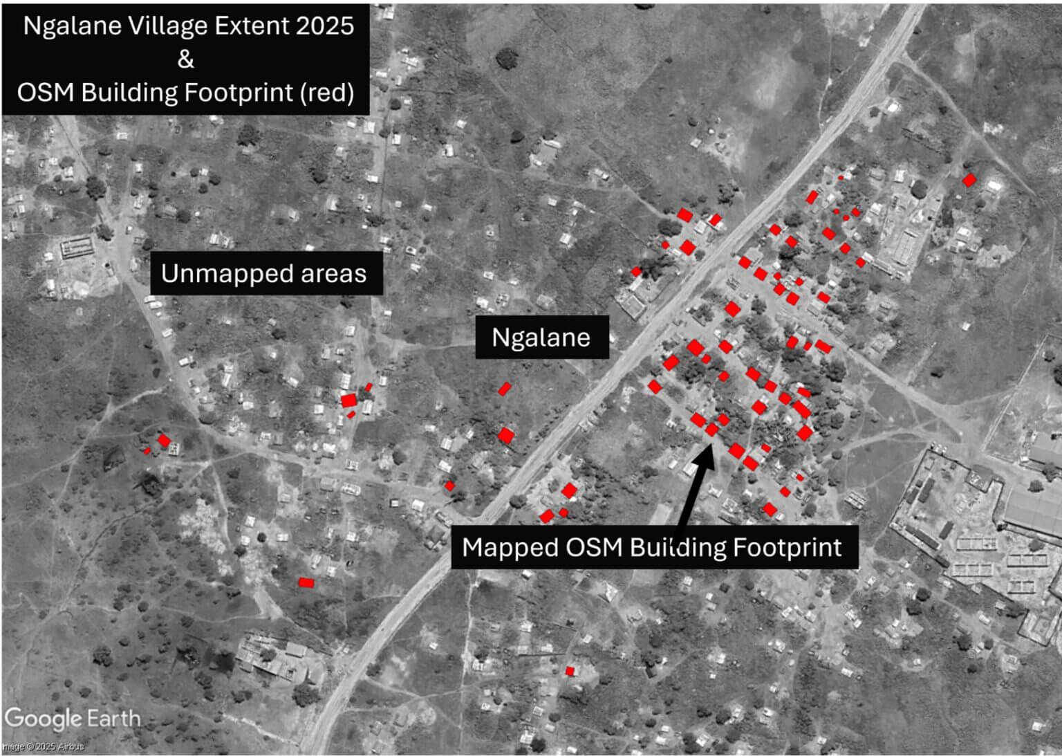
To update the community’s important mapping data, we have created a task in the HOT OSM Tasking Manager to begin mapping new buildings in Ngalane. Follow this link to create an account, complete OSM mapping training, and start mapping buildings in Ngalane! Your efforts will help create important mapping data for this community, which will help prepare for future storms in the region.